tedconnect
Redesigning the digital hub for convention attendees
company
TED Conferences
role
Freelance Product Designer
Responsibilities
UX/UI Design, Interaction Design, Visual Design, Design Systems
team
Robert Spica (Principal Product Designer), Ryan McHenry (Product Manager)
About TEDConnect
An essential resource for TED events
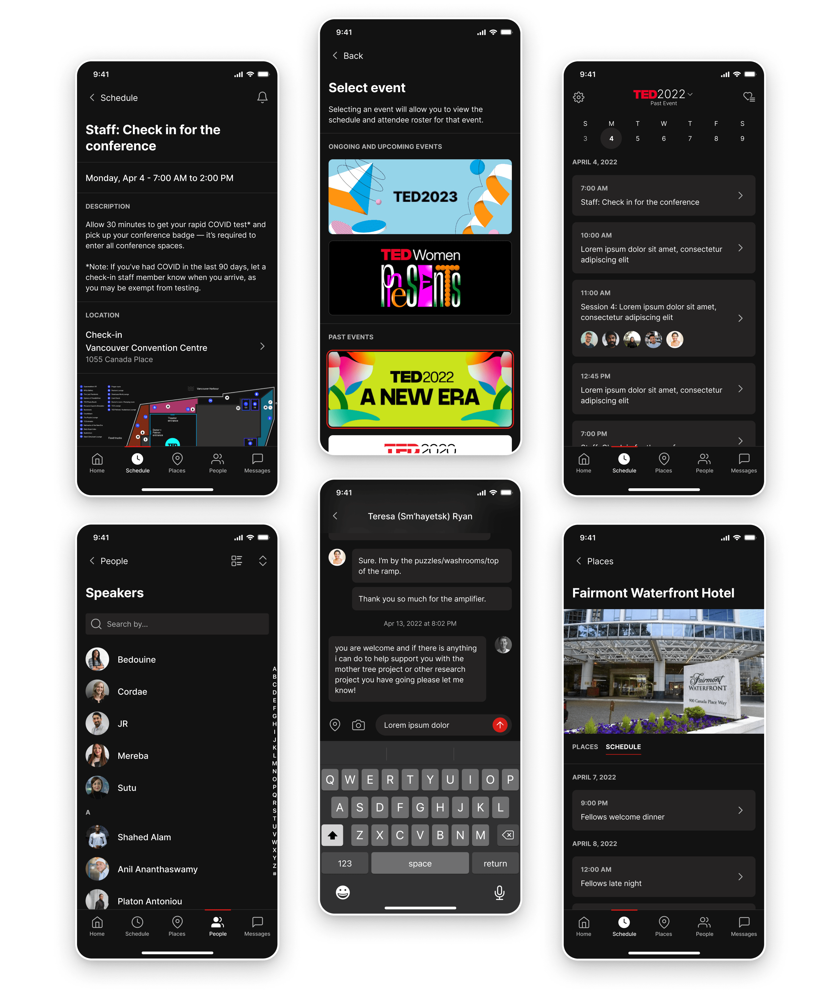
The TEDConnect app is where attendees can receive live updates, message other attendees, view daily schedules for the entire conference, and get directions to events both inside and outside of the convention center. TEDConnect is used by thousands of attendees each year with an adoption rate of over 92%.
The app has been met with positive reviews and therefore has largely stayed the same since its initial launch in 2013. For their next conference in 2023, TED was interested in making a splash and exploring improvements to the visual design in order to bring it up to current times, beginning with introducing a dark mode and ending up encompassing much more. I was the core designer responsible for designing dark mode for the TEDConnect app, consolidating styles and taking steps to align the app towards a future global TED UI, identifying UX/UI opportunities and crafting solutions for them, and putting together toolkits, guidelines, and other documentation for developers and designers down the road.
This project is expected to ship in Q2 of 2023.
Research
Analyzing the current design
At the start of the project, it was unfortunately determined that there would be no separate budget for usability testing, however, we still had a treasure trove of data to pull from. All the analytics from past events were available to us if needed. Additionally, many TED employees attended the most recent convention in Vancouver, including my team members, and therefore had the experience as a user fresh in their minds.
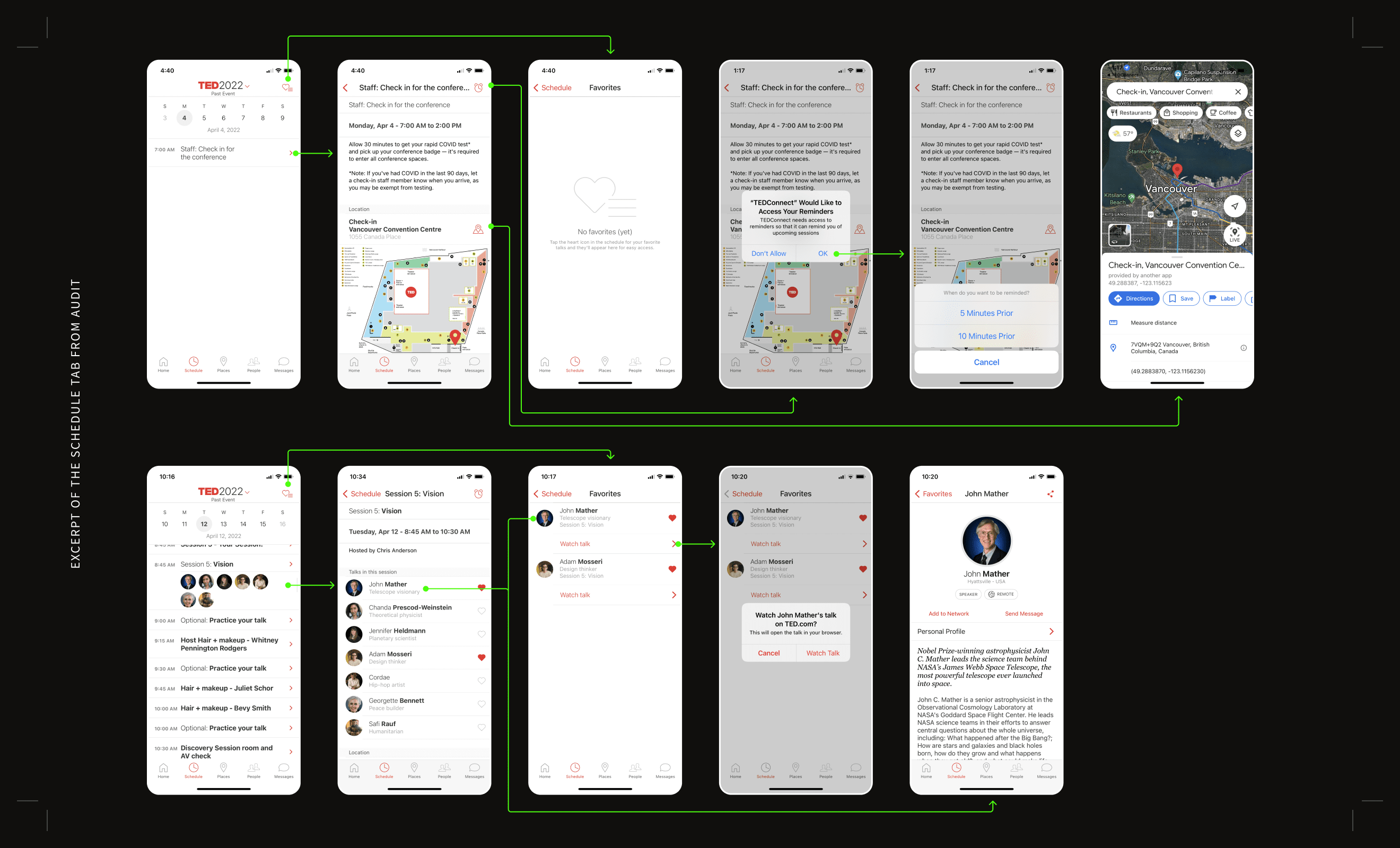
I started the project by conducting a full audit and creating an application map of TEDConnect as is. This was key in order to provide an overview and familiarize myself with the overall app experience. Initially, key screens were picked to focus my design efforts around but that approach proved to be short-lived as there were too many intricacies to just focus on a few screens. The redesign eventually was tackled across the app holistically.
Micro case studies
Select areas of focus during the redesign
Click on a link below to scroll to the relevant section.
UI design
Designing for dark mode
UI design
Redesigning “Places”
ux design
Differentiating between global and local navigations
design systems
Taking steps towards a universal TED UI
Micro Case Study #1
Designing for dark mode
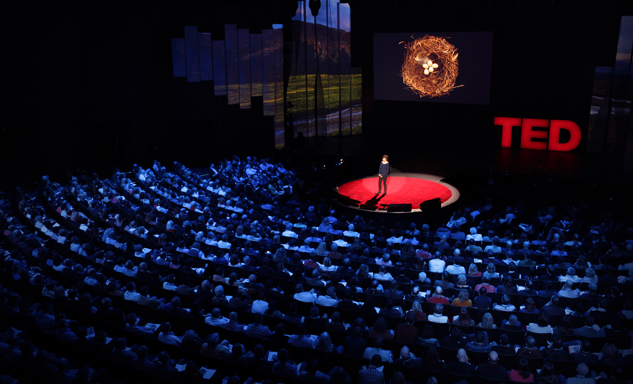
Bright screens are great in some situations but are a nuisance in others. TED speaking events are hosted in large theaters under dimmed lights—a place where you wouldn’t want dozens of distracting, white screens powering up. The current TEDConnect app did not have a dark mode so in order for attendees to check where their next event was located, they had to pull out their phones and squint their eyes at the blaring brightness of their screen. This was the primary trigger for us to build a dark mode for the app.
This project also had the added complexity of building and contributing to a universal TED UI kit that was still being explored at the time. TED’s products had been developed at separate times and therefore created separate UI kits. Though the development of the TEDConnect app would be handled by a third party team for the time being, eventually we wanted to bring the app in house and link all the products together seamlessly under one design system. Over the course of this project, I regularly met with 2 other product designers working on separate products, along with the principal product designer, to ensure that we were all making decisions together and moving as one towards the same unified design system.
Key considerations
Respecting the colors of the core product
Designing for dark mode is more daunting than simply assigning blacks and grays to the current design. There was a previously designed dark mode within the core TED app, however, I wasn’t able to use it as a bible and layer those colors onto the TEDConnect app. Those designs were made several years ago and were not up to date with current color accessibility standards, plus, the TEDConnect app has added design elements that are not accounted for. It was a good starting point but more exploration was needed.
The challenge lies in creating a new dark interface that feels familiar to the core app while bringing it up to WCAG AAA standards for text and WCAG AA standards for graphic elements. To tackle this challenge systematically, I started with the original TEDConnect app designs and layered on updates from the core TED app. From there, I determined what didn’t pass from an accessibility perspective and pinpointed opportunities that could be explored and addressed in my new designs.
Key considerations
Creating a semantic system
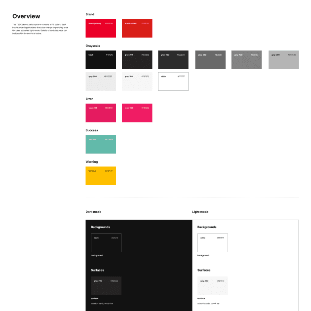
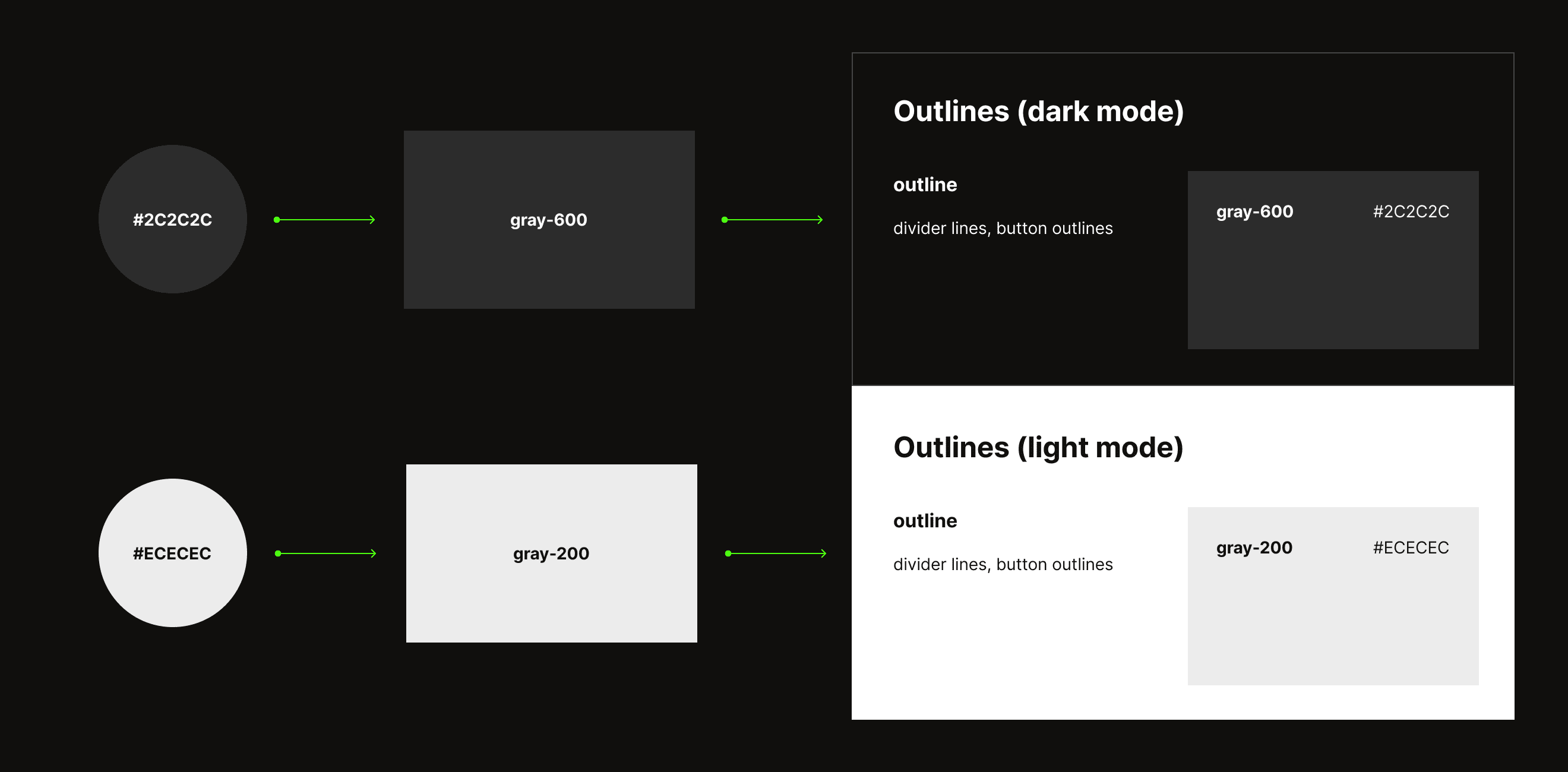
I worked on a new semantic system to define our colors across the TEDConnect app to make it simpler for designers and developers alike. This first required defining a color ramp to make the newly determined hex codes easier to reference by name. From there, I was able to use those names to help inform color tokens. Adopting a system of tokens allows us to assign multiple color values to a single component. For example, the background component could be either #121212 or #FFFFFF depending on which mode the component is currently set to, dark or light. This leads to easier, faster, and more consistent designing and developing.
This system was created with the additional consideration of steering TED towards universal TED UI. For a deeper dive into the documentation and the UI toolkit behind this, read more about it in the micro case study here.
Key considerations
Implementing interface solutions along the way
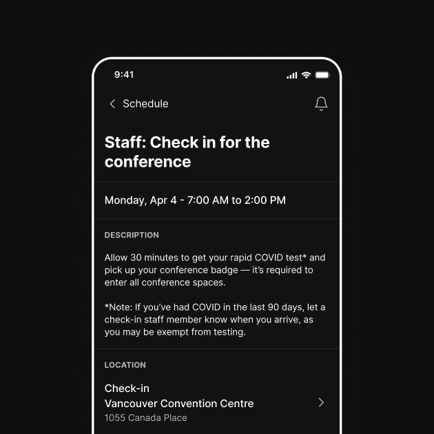
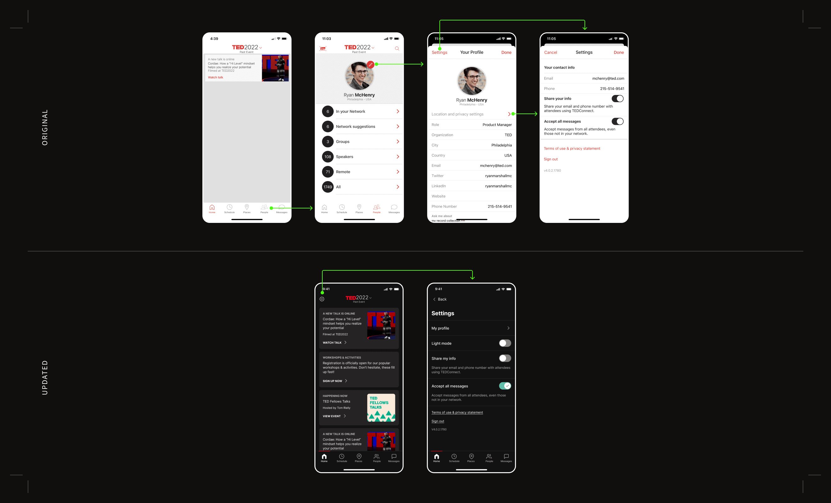
Creating a dark mode for the app also means creating an affordance for users to turn it on and off. The solution seems glaringly simple—make a toggle switch—but trouble presents itself when deciding where the new switch should live. The issue with the current app design is that the settings page lives nestled deep within the user’s profile page. Though it is the logical place to put the affordance, locating it there wouldn’t allow users quick and easy access.
To solve the issue of access, we decided to move the application settings from the user profile page into a global settings icon that would be present across all screens, a more universally understood standard. This move was also made in conjunction with the decision to create a standardized top navigation for the app. For more information on this part of the project, please see the micro case study here.
Micro Case Study #2
Redesigning “Places”
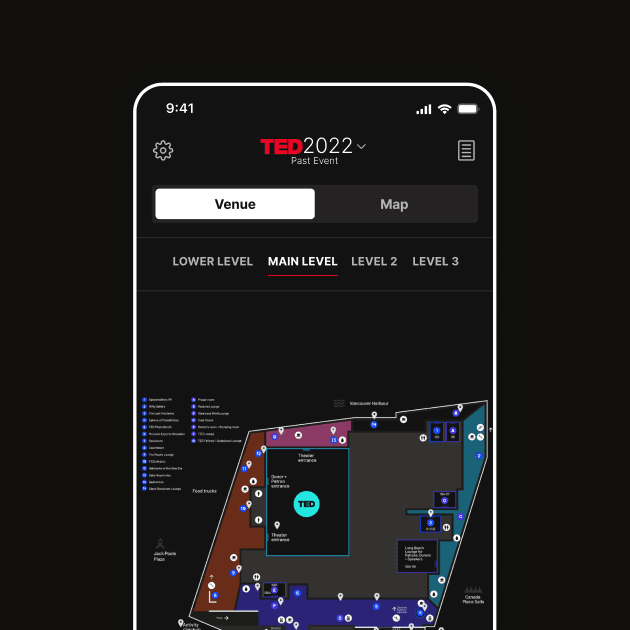
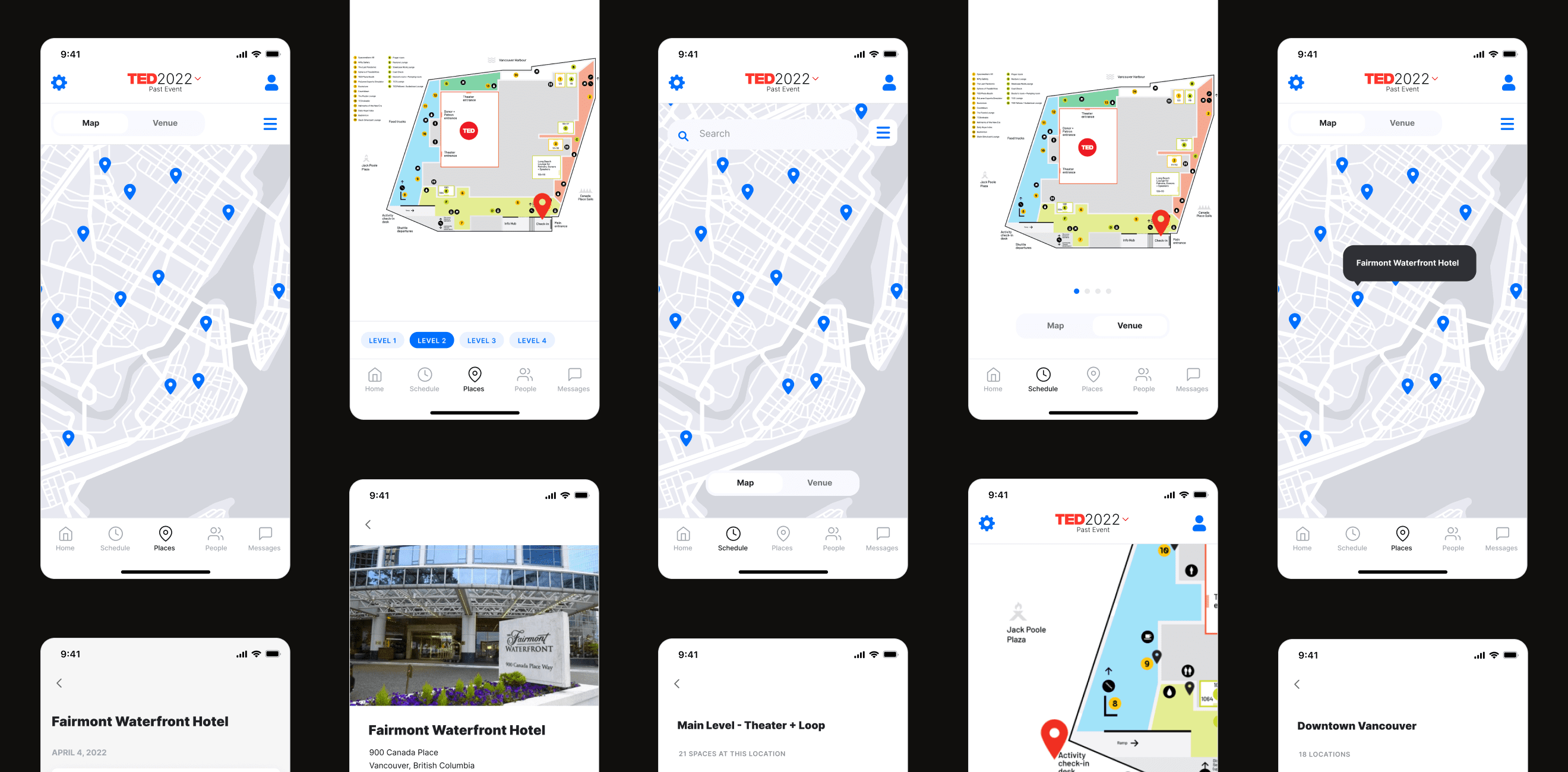
Viewing maps of the venue and the surrounding area is a crucial feature for the TEDConnect app. Speaking events and gatherings are hosted in multiple locations all across downtown Vancouver and attendees need an easy-to-use directory in order to find everything. Due to its high-impact nature, “Places” was an important area of focus.
Problem
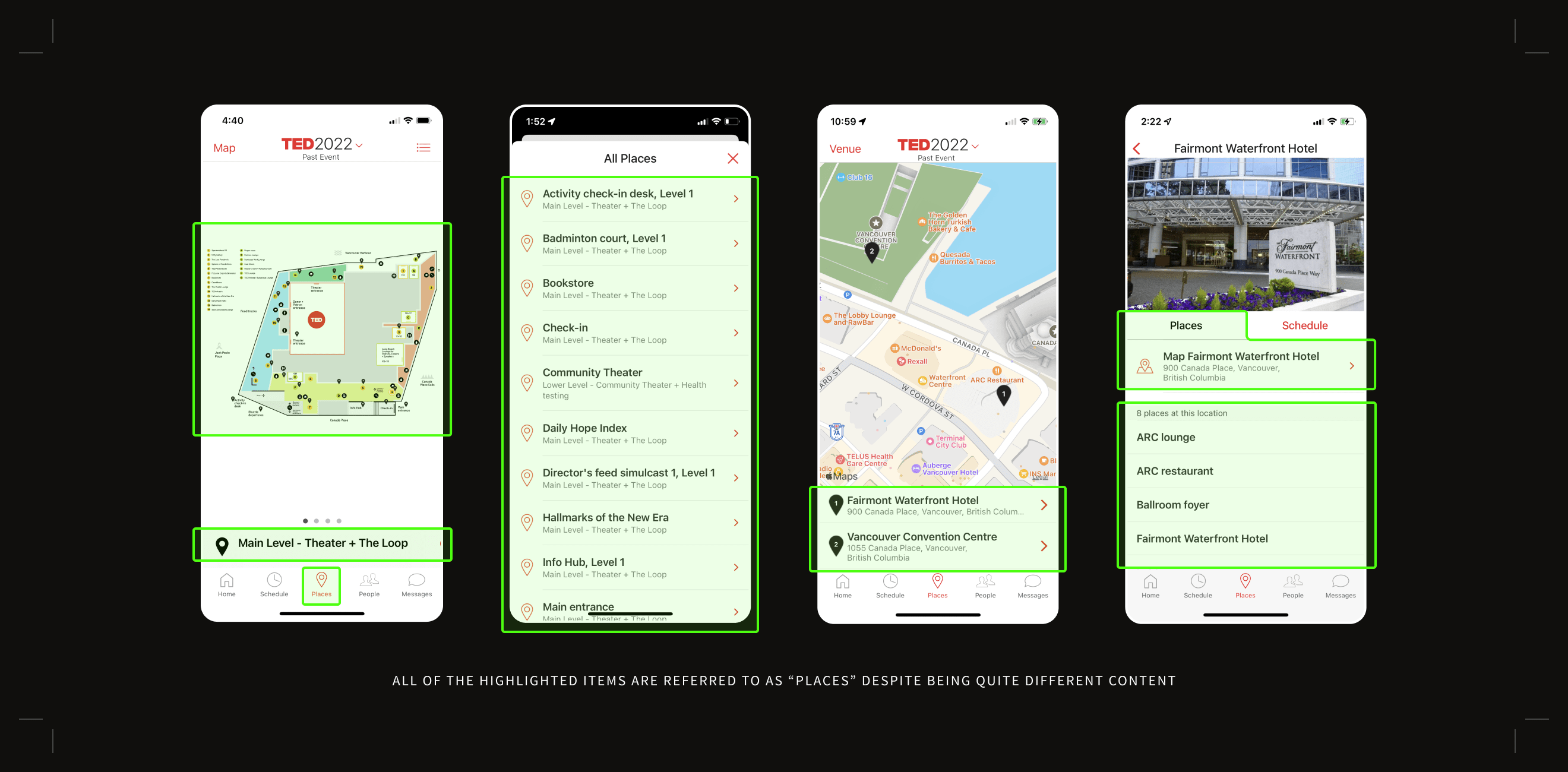
The term “places” is used to describe multiple things
An issue that came up during my heuristic evaluation was regarding the use of the word “places” across the app. While the term is used correctly, it is a singular word used to describe several subsections of information making it difficult for information to appear in a clear logical order. The information architecture needed additional thinking.
Solution
Making the taxonomy more granular
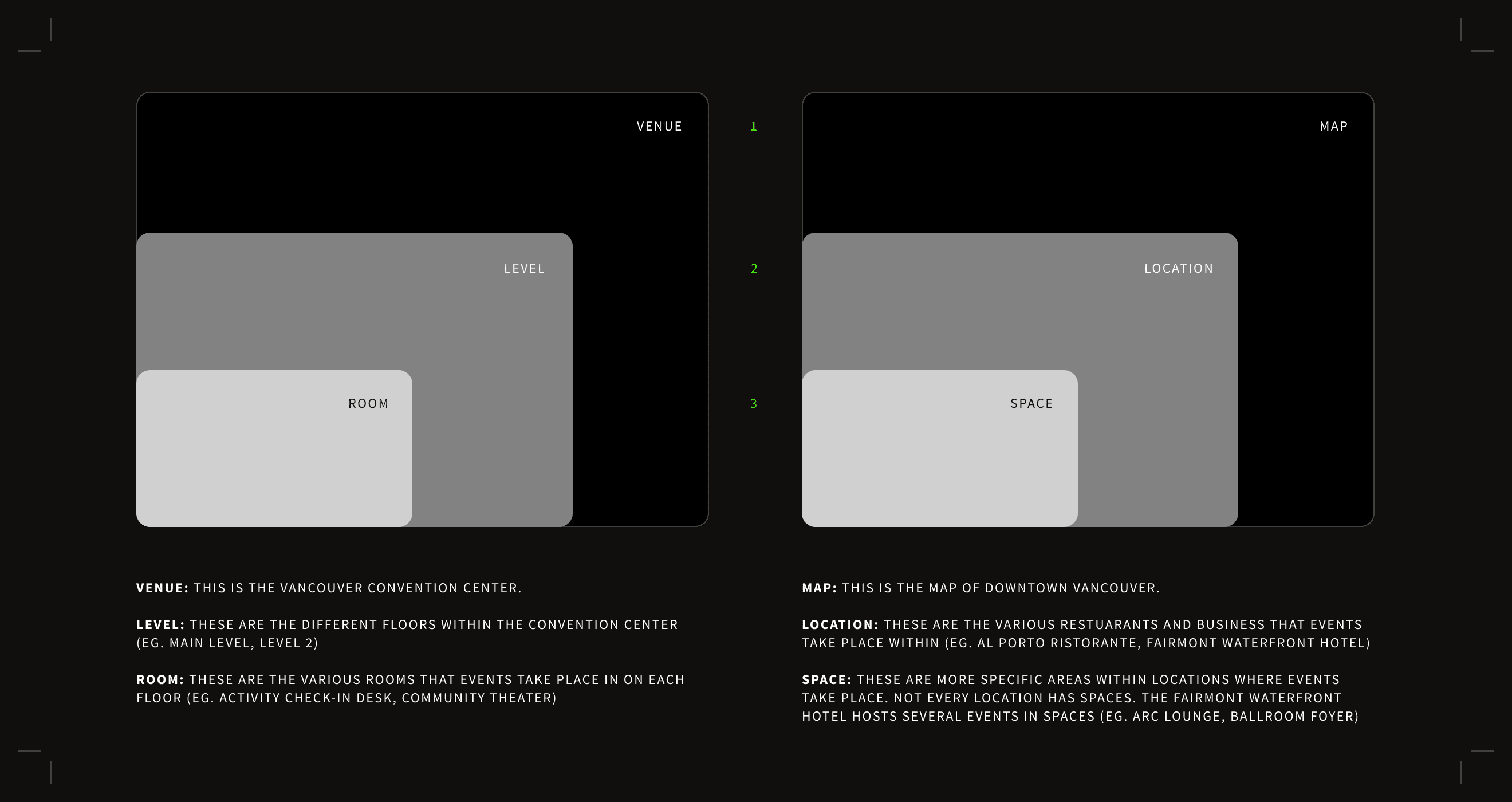
The annual TED conference takes place in multiple locations and it can be difficult to keep track of where everything is. To create a clearer navigation for our users, I developed a new taxonomy to refer to different layers of information.
The first choice that users would need to make is knowing whether the event that they’re looking for is located in the convention center (venue) or outside of it (map). After that, the taxonomy funnels down into smaller units.
Problem
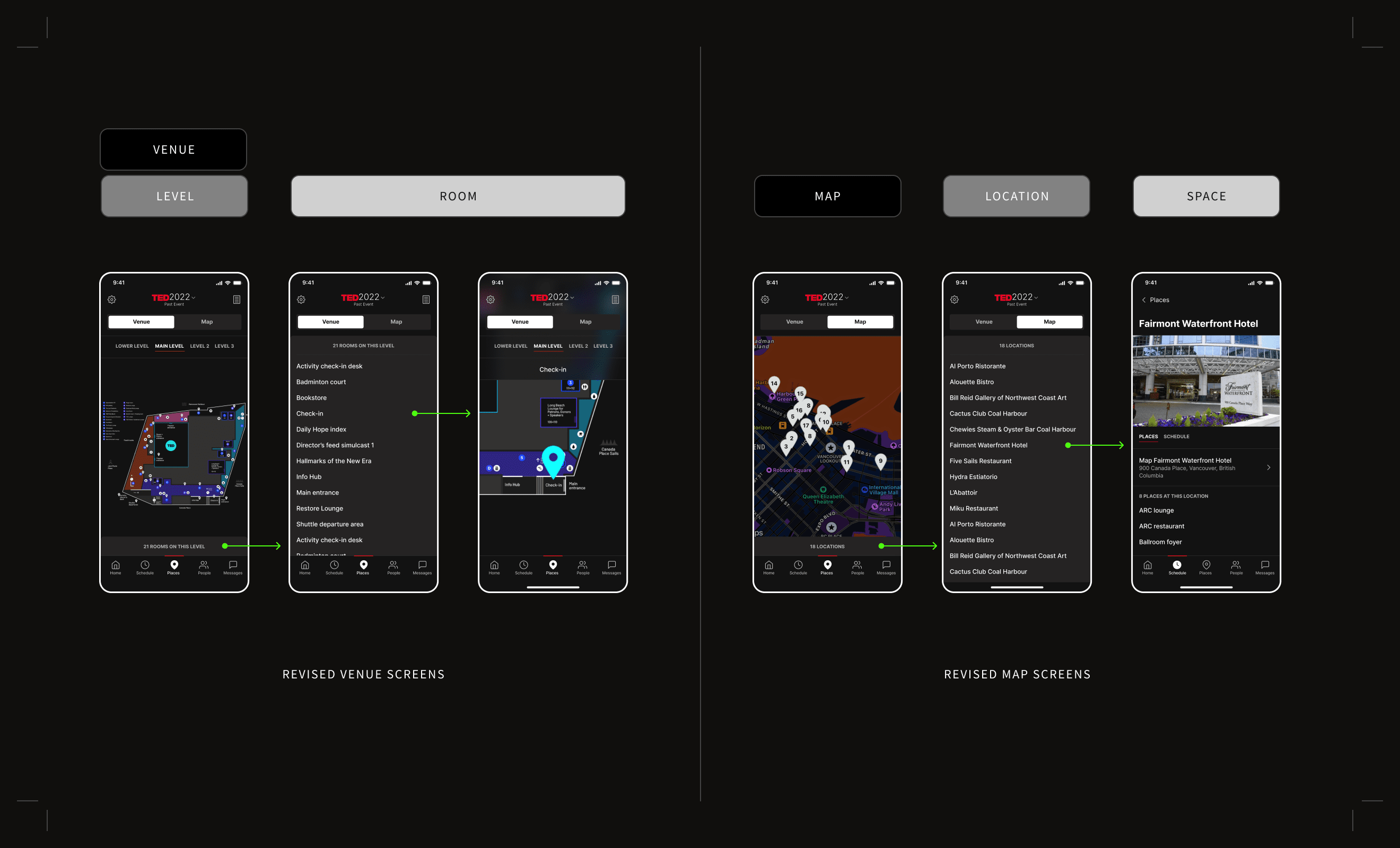
The interface within “Places” contains usability issues
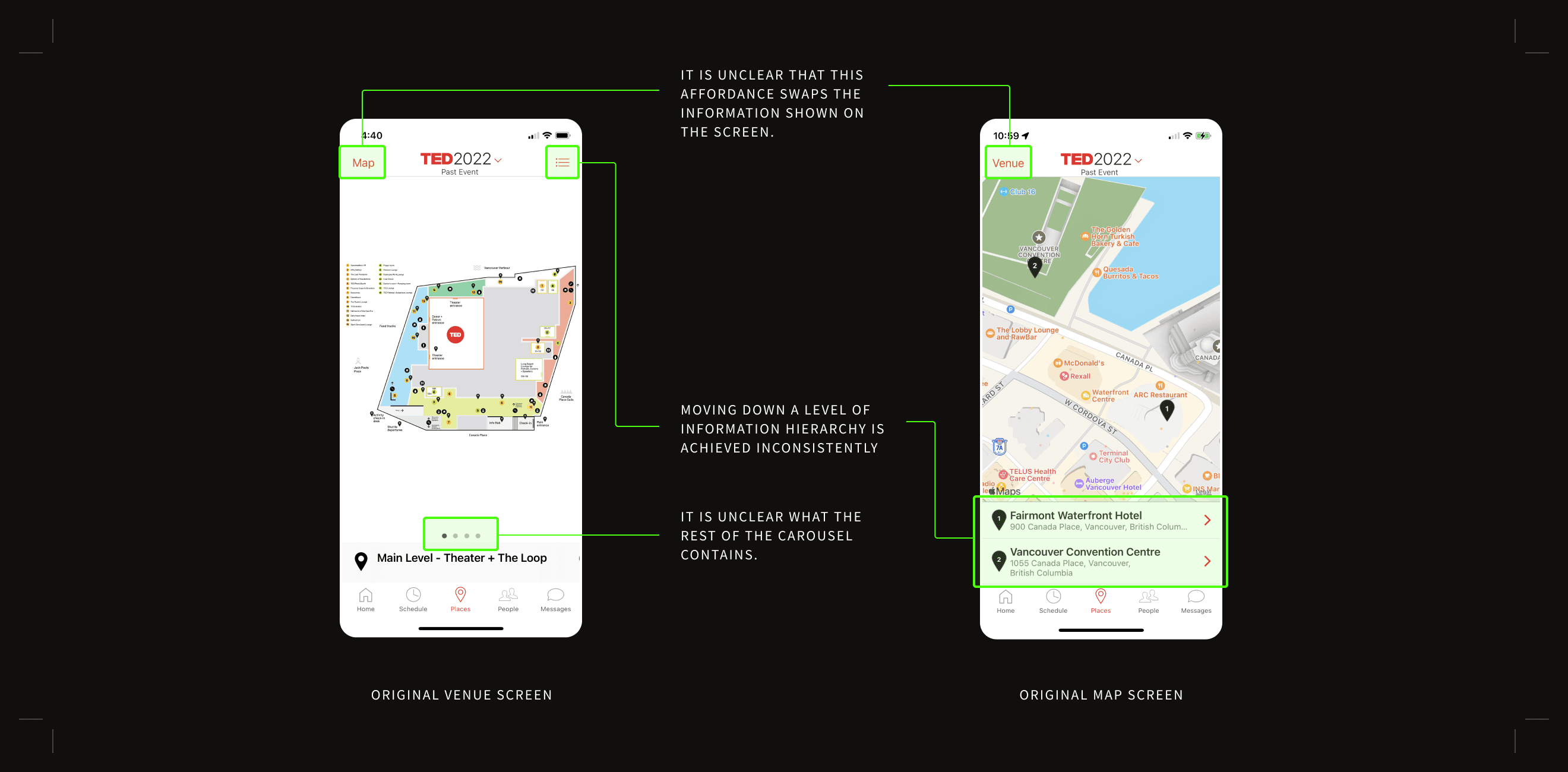
The “Places” tab contains two similar categories of information but there isn’t internal consistency of how the two are displayed. Additionally, the interface requires exploration for new attendees to learn to navigate through it as affordances are not standard or clearly labeled.
Process
Wireframing a new interface
I began by researching existing patterns that felt familiar in apps that dealt with location-based information (such as Airbnb, Yelp, and Tripadvisor) to minimize in-app learning. Working with the Principal PD, I used that research plus the revised “places” information architecture to explore new wireframes.
Solution
Creating a clear and consistent UI
This section of the app went through the largest overhaul and the team was excited with the updates. Some key changes included:
- Using toggle buttons to clearly indicate switching between the opposing options: “map” and “venue”
- Using labeled tabs instead of an unmarked carousel to navigate between the different levels of the convention center.
- Creating a more natural path from the first level hierarchy (located at the top of the screen) to the third level (located on the bottom of the screen)
- Moving the third level hierarchy of information down into an expandable drawer
Though this design solution was explored, we ultimately decided to pause on including this within the next release as the changes in the interface were too significant to implement without true user testing.
Micro Case Study #3
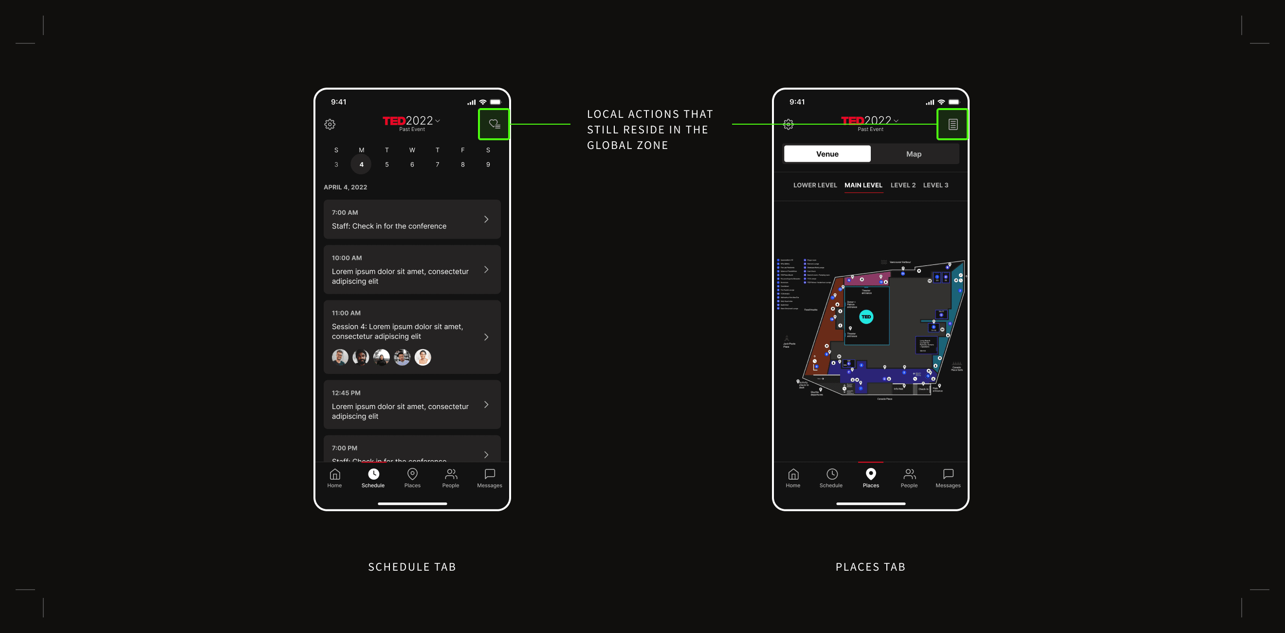
Differentiating between global and local navigations
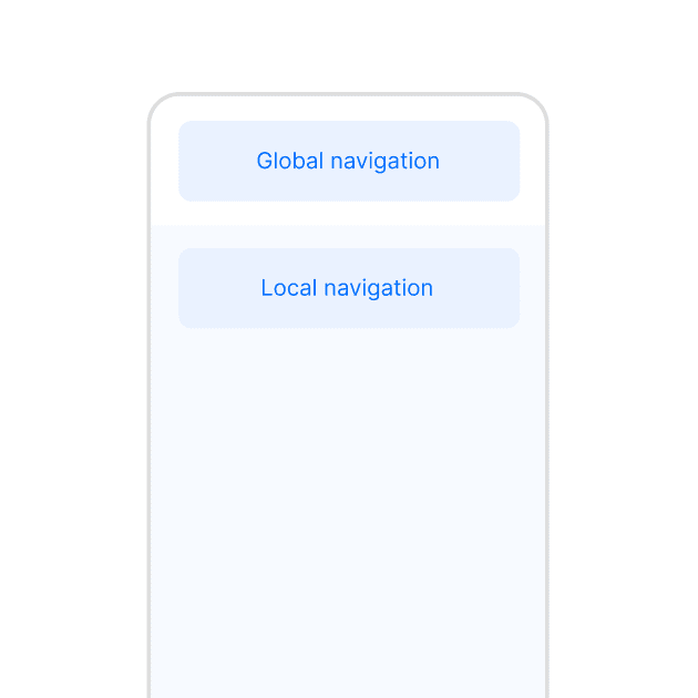
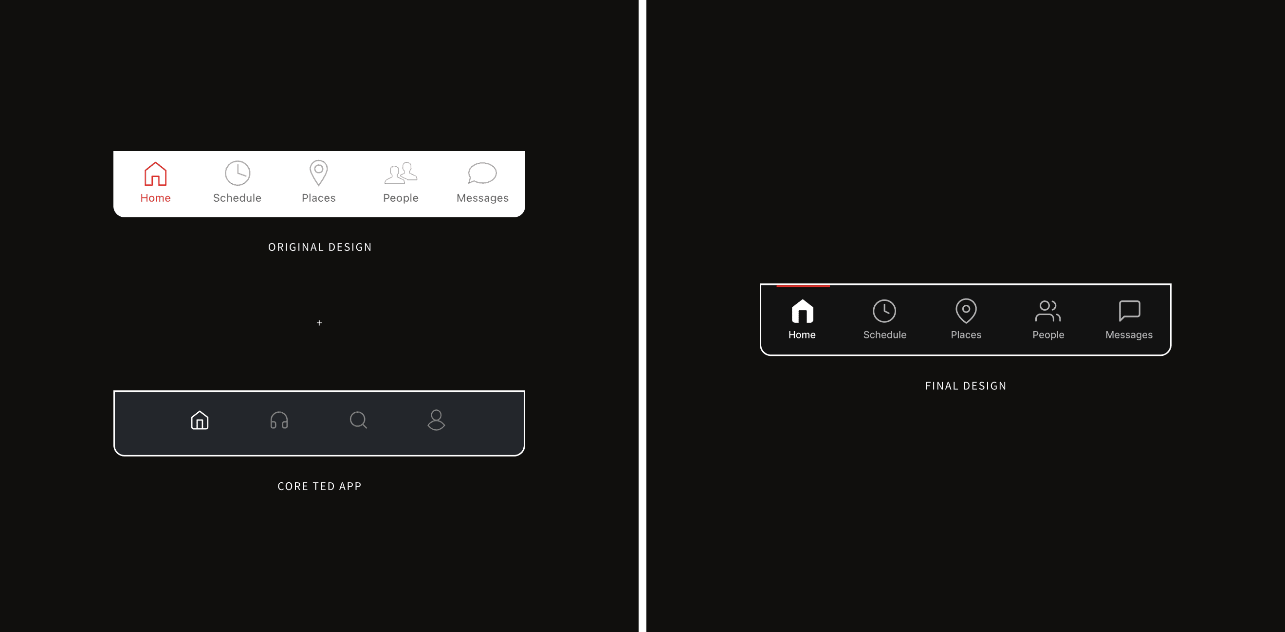
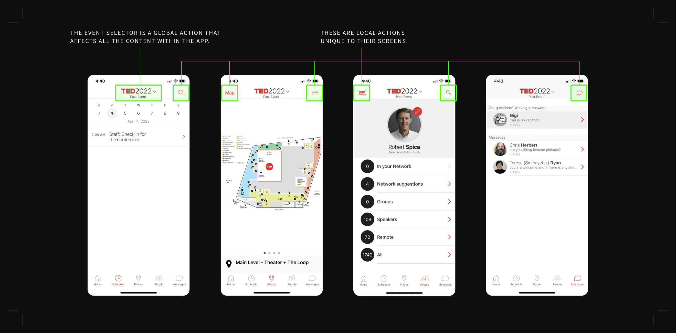
The current app design is a mix of a global action (affecting the state of the entire app) and local actions (affecting the state of the current screen in focus). The addition of a dark mode necessitated a place to easily access the app settings, another global action. To reduce complexity and establish familiarity within the app, we decided to rethink the structure of the top navigation.
Solution
Creating specific global and local zones
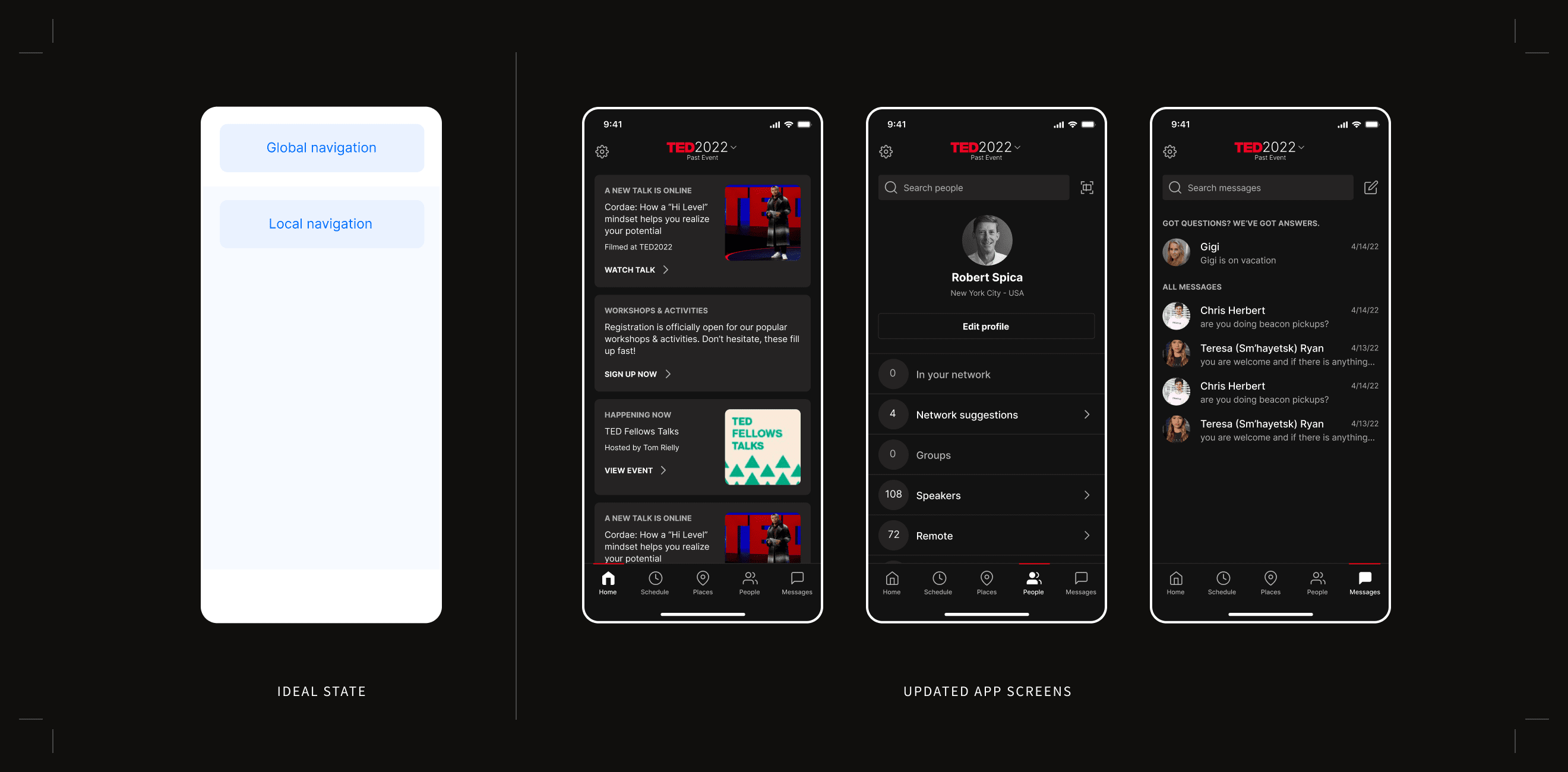
The interface is now thought of in two distinct zones. A global zone would live at the top of the screen and be reserved for actions that stay the same throughout the app. A local zone just below would house affordances that can change depending on the needs of the current screen in focus.
Future considerations
Consistent implementation of the new zones
The new solution solves most of the navigational conflicts, however, there are two that remain—one in the “Schedule” tab and one in the “Places” tab. Though a solution was designed for the instance in the “Places” tab (which you can see here), updating the design for those necessitated larger conversations that were out of the current scope of the project. Our team decided to move ahead with the design and mark these two sections for further discussion in the future.
Highlights
Improvements to the visual design
Over the course of the project, I discovered a few different opportunities to improve on the visual design by making content more digestible or more impactful. Below are two highlighted examples.
Highlight
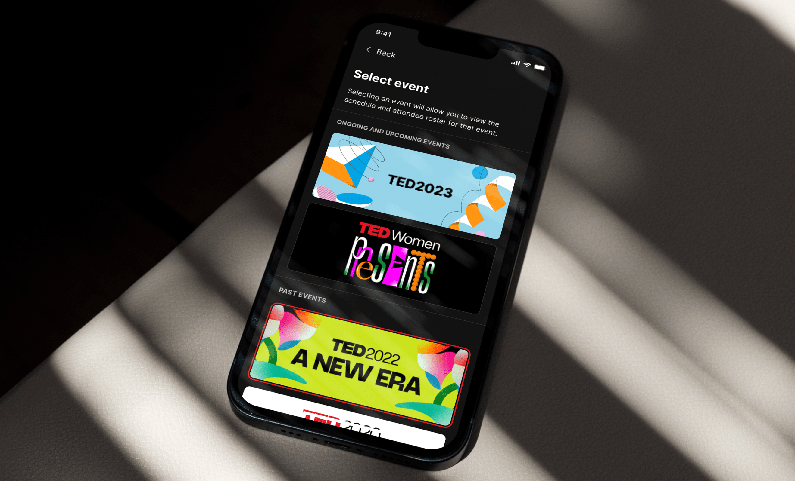
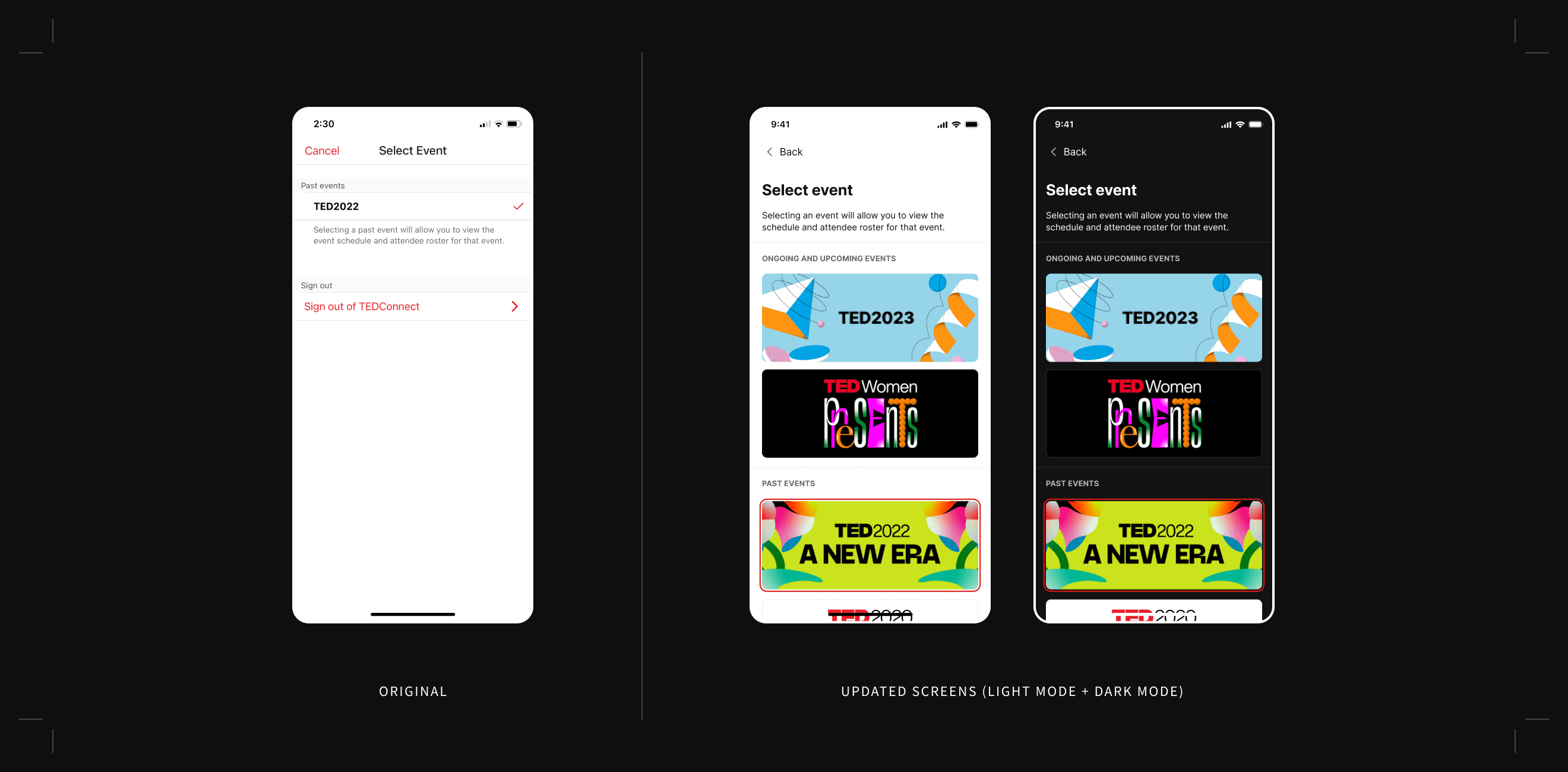
Select event
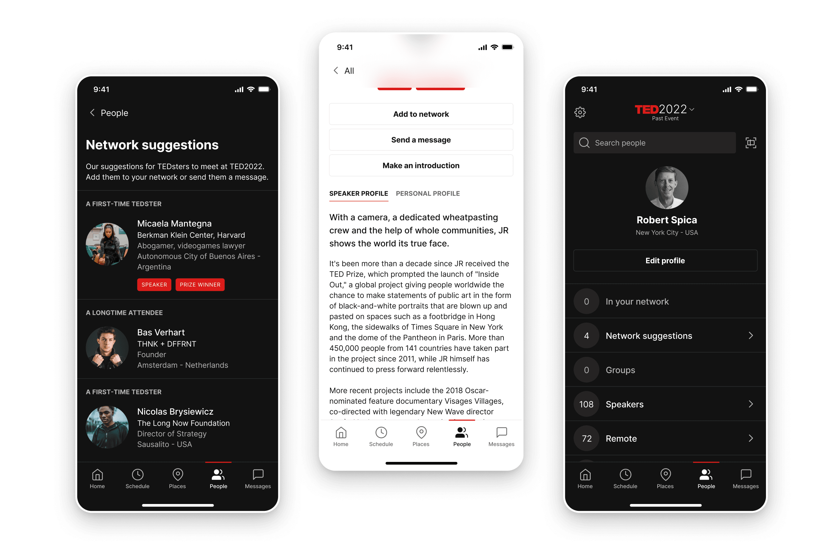
The TEDConnect app attaches its content to individual events. Clicking on the name of the event in the top navigation allows users to go back to previous conferences they have attended to see past schedules and talks. The current screen to change events is functional but falls flat in overall tone. I decided to leverage the campaign artwork that is created for every TED event and create large tiles that are both easier to click on and easier to recall due to the distinctive colors. An attendee may not remember which specific year they attended a talk but they may remember that they were holding green pamphlets.
Highlight
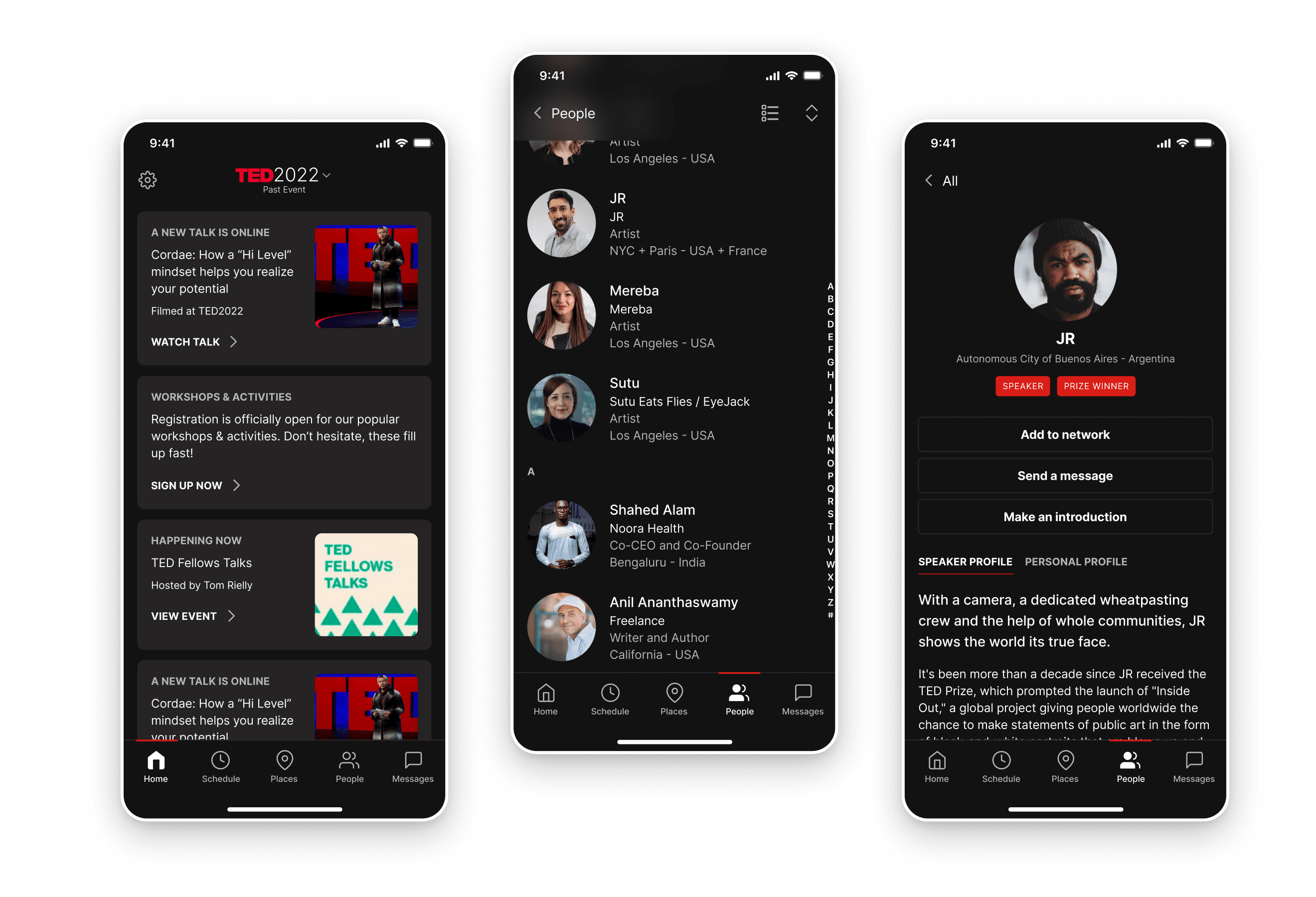
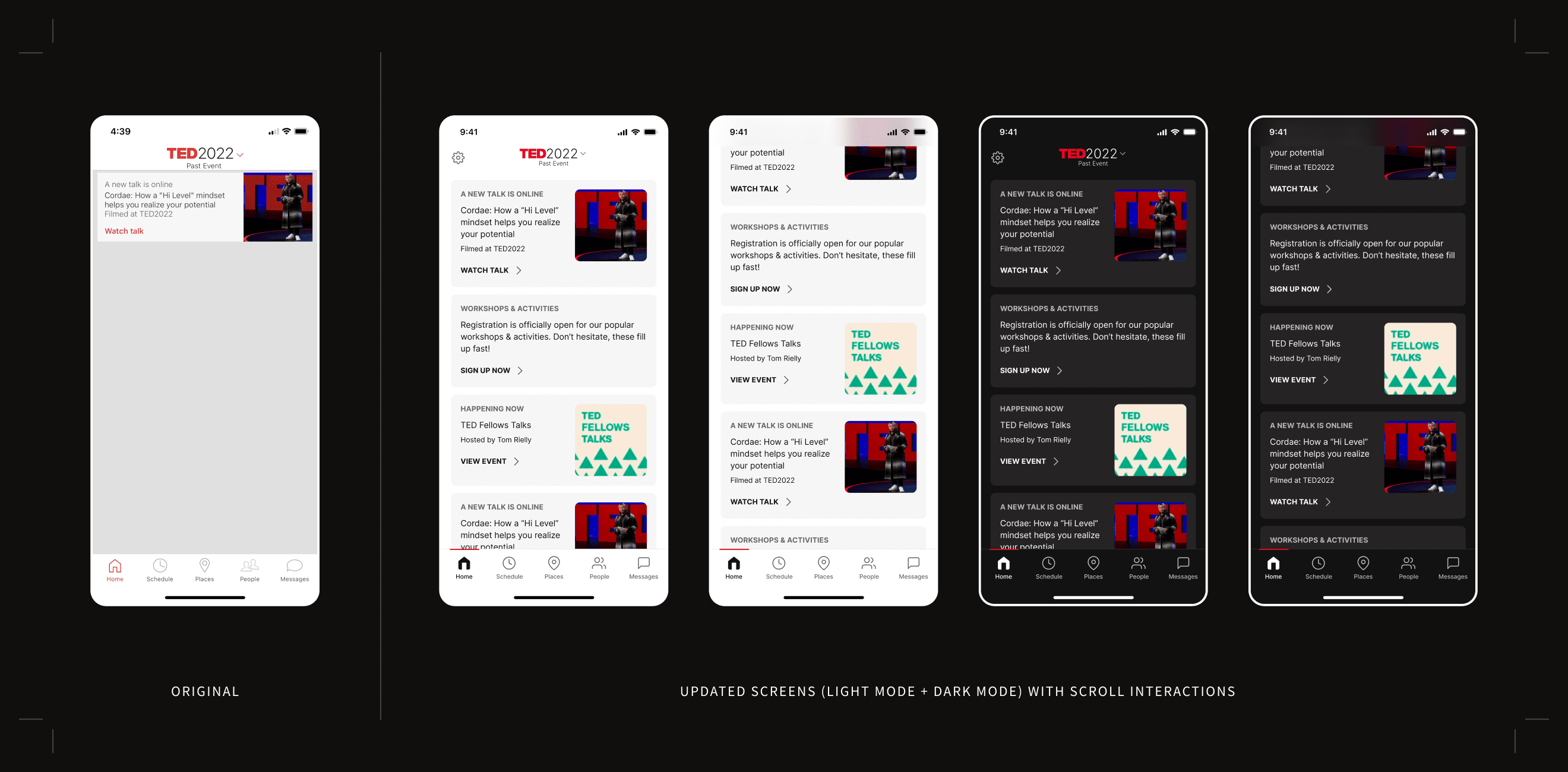
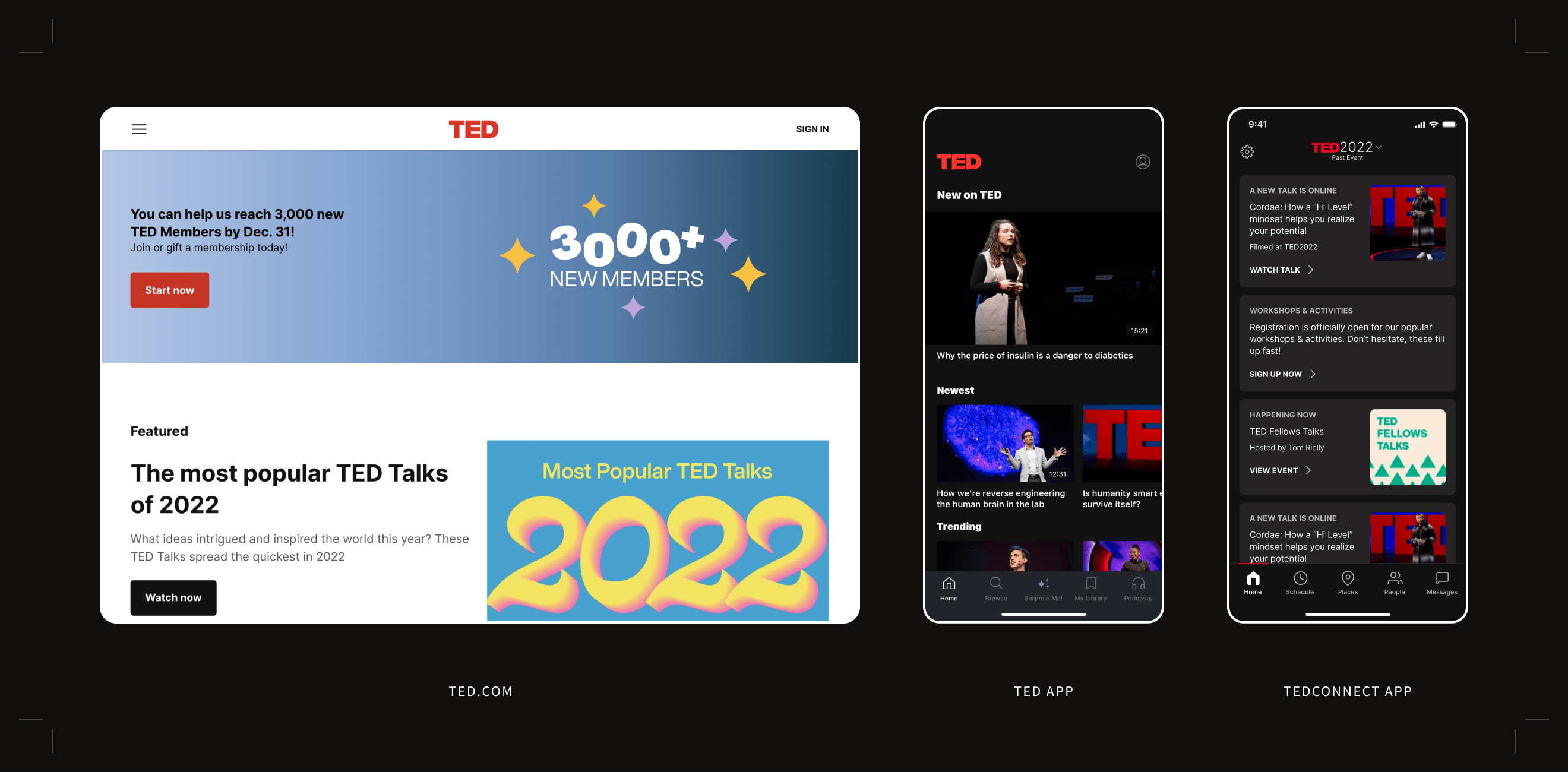
Home screen cards
The card modules on the home screen in the original designs had some room for improvement. By aligning typography to a larger, easier to read typestack, addressing color contrast issues, and adding white space, I was able to enhance visual hierarchy and the layout of information. I also rethought color assignments to ensure that switching between light mode and dark mode would be seamless.
Micro Case Study #4
Taking steps towards a universal TED UI
TED Conferences has released multiple products over the years such as a ted.com, the TED app, and TEDConnect. Each product was released at different times by different teams and are at different stages of maturity. This led to there being multiple toolkits being developed with similar styles.
There was a big desire internally to move us towards a universal TED UI, a single source of truth that would span all of the different product offerings across the TED ecosystem. This would be a huge milestone in helping with design and development time and overall brand consistency—understanding that this would be an effort that would need to be accomplished over years.
While having a separate toolkit was not an immediate concern for TEDConnect (since the release I was working on would be developed externally), this was an opportune time to make some strides in aligning towards a universal design system. The toolkit developed here could be used as a way to figure out what color swatches and type styles are really needed and start to consolidate any overlaps into a standardized system.
So where do we start? Yes, it was possible to continue designing dark mode for TEDConnect separately but that would likely mean picking color and type styles that don’t align with any other UI kit and then we would still need to tackle the work of universal alignment later on. But we also couldn’t pick up another UI kit as is and use it for this project because they don’t account for all of the design elements present in this app. Additionally, the web UI kit, though the most robust, was being updated at the same time. How can we stop creating duplicative styles and start consolidating towards a universal TED UI?
Process
Breaking down the work into manageable pieces
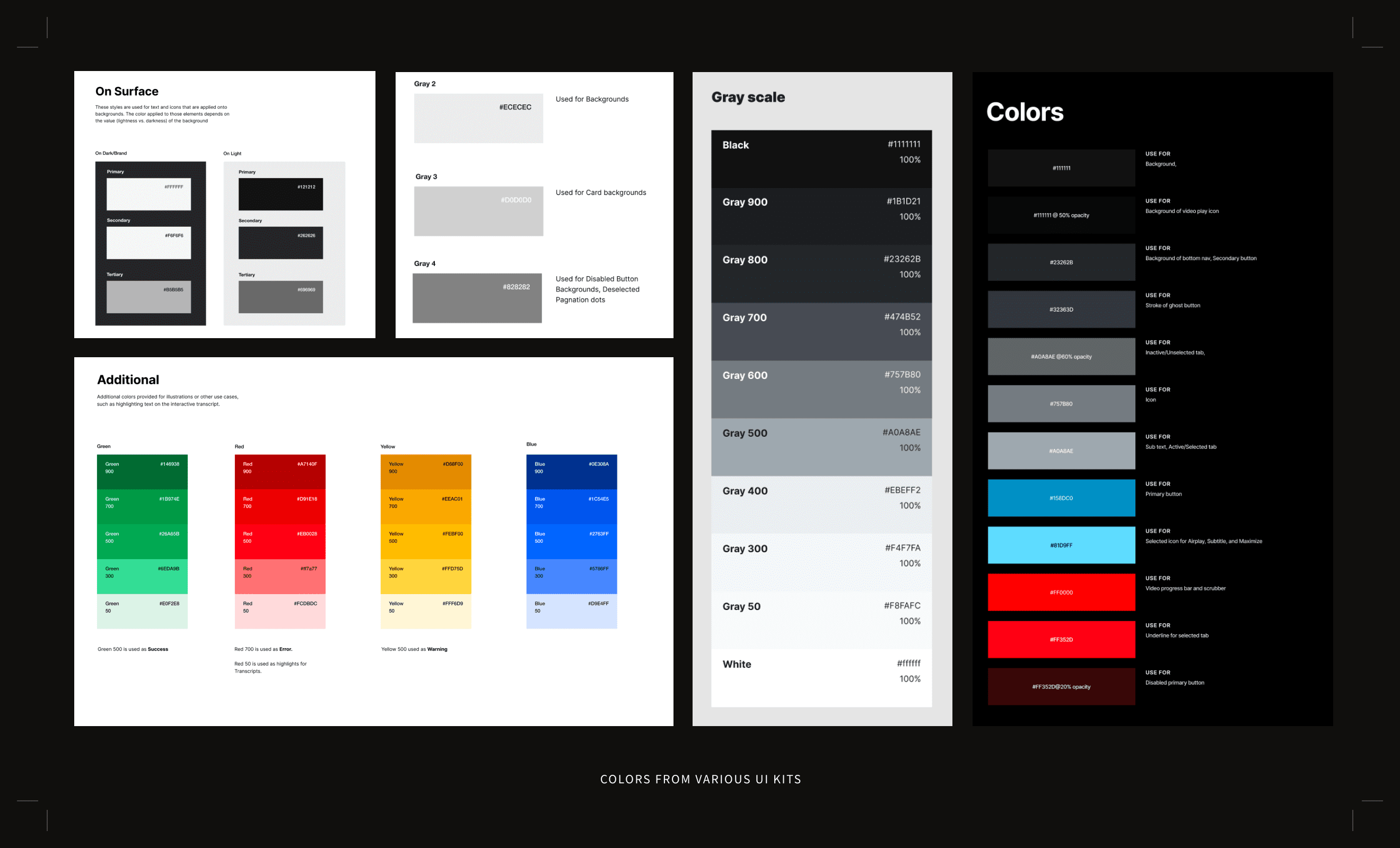
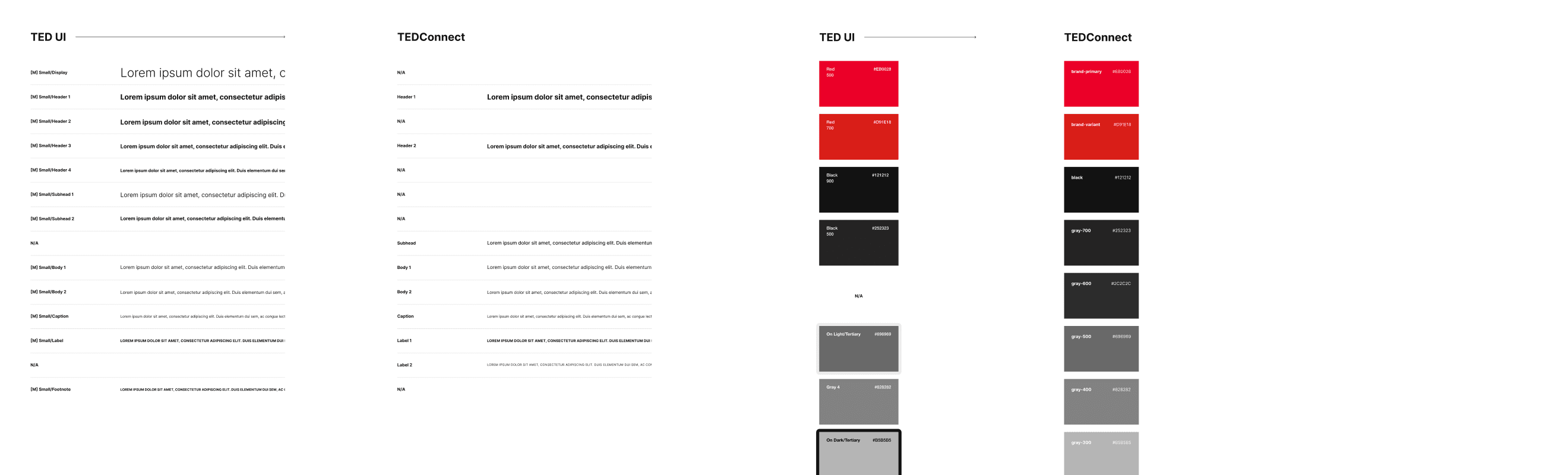
I decided to break down my explorations into a step-by-step process. First, I started by designing and choosing color values using my own design eye as guidance. Once I settled on color values that worked well, I went back to the previous UI kits and checked if there were any established swatches that lined up close to my designs. If there were any close matches, I would test them in my designs to see if they worked from both a visual and accessibility perspective, and lock them in if they did. In the end, there was only one color that wasn’t covered by a token in another UI kit.
The same thought process was used when exploring the new typestack for TEDConnect. Two additional type styles needed to be added while the rest were able to be leveraged from another UI kit.
Documentation
Leaving a clear trail for designers and developers
Once the designs have been signed off on, it was critical to leave clear documentation detailing the process. Though the goal is to eventually move towards a universal TED UI, we weren’t quite there yet. My designs would not be able to use the same nomenclature for the styles from the other UI kits because it would be nonlinear—I would still need to create a new semantic system for typography and color for TEDConnect for now.
To accomplish this, I crafted thorough documentation for developers that detailed the new type styles for the app and guidelines for each style’s use case. Similarly, for color, I detailed out new color ramps and color tokens as well as where each would be used in light mode and dark mode.
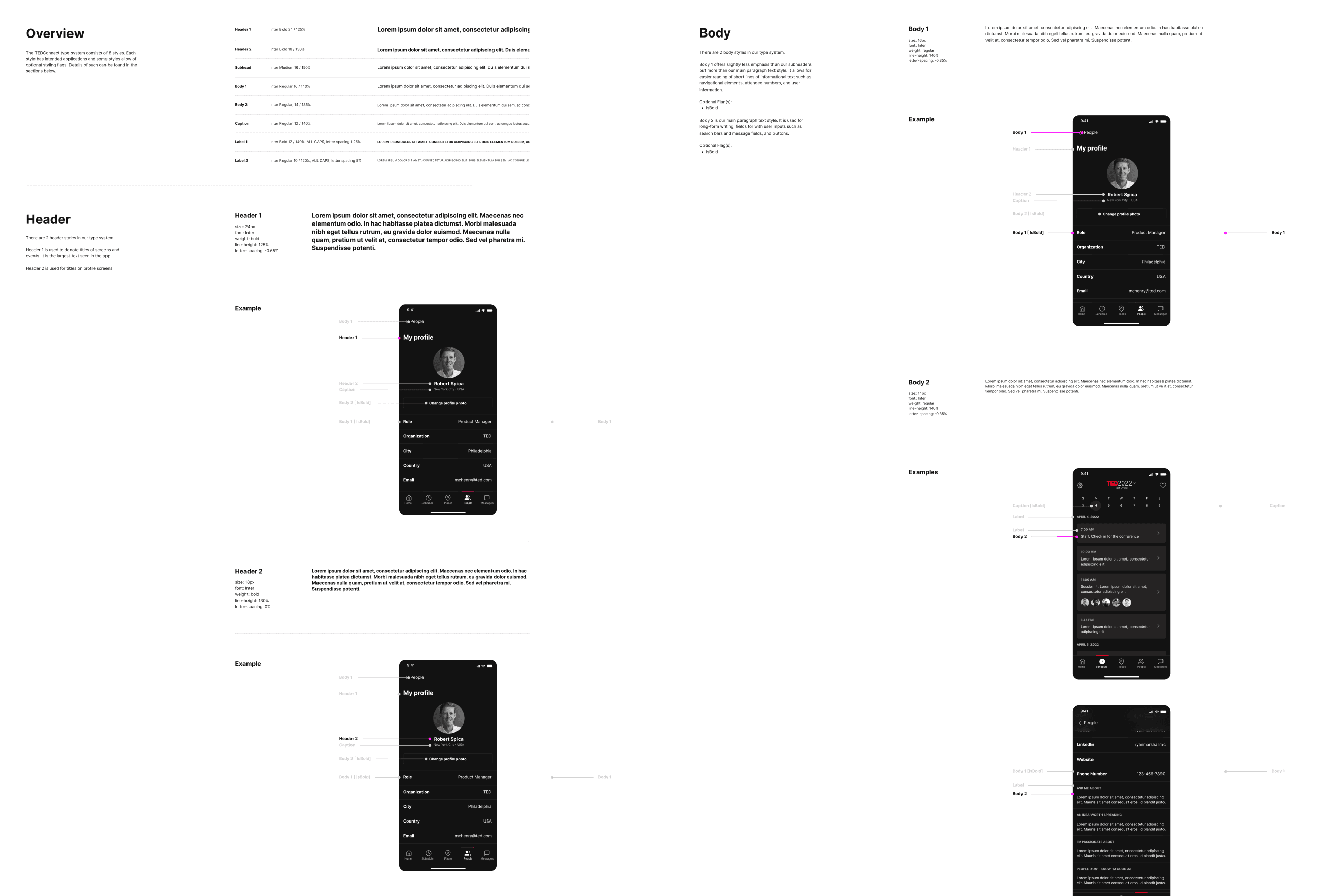
Excerpt of typography from developer documentation
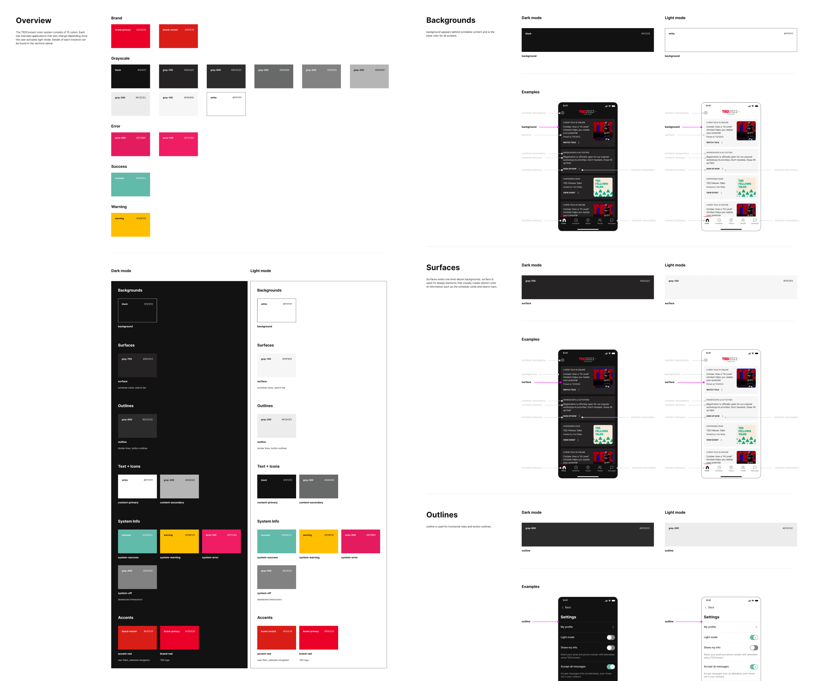
Excerpt of color from developer documentation
When it came to documentation for the product design team, I was sure to list out the styles that are used in TEDConnect and where they were sourced from. I also made it clear where new styles were created just for the TEDConnect app. In the future when there is a consolidated, universal TED UI, this directory will make it easier for designers to remap styles.
Excerpts of typography and color from designer documentation