waze road trips
helping friends drive together
company
waze
type
Conceptual project
timeline
3 weeks
responsibilities
research, UX/UI design, usability testing, prototyping
about waze
Contributing to the common good on the road
Waze is a crowd-sourced navigation app with a mission to make people’s time on the road more rewarding. By simply driving with the Waze app open, drivers (commonly referred to as “Wazers” within the community) share real-time information that translates into traffic conditions and road structure. Because of such, Waze has built up a loyal user base and has an inherently more social aspect when compared to competitors.
The challenge
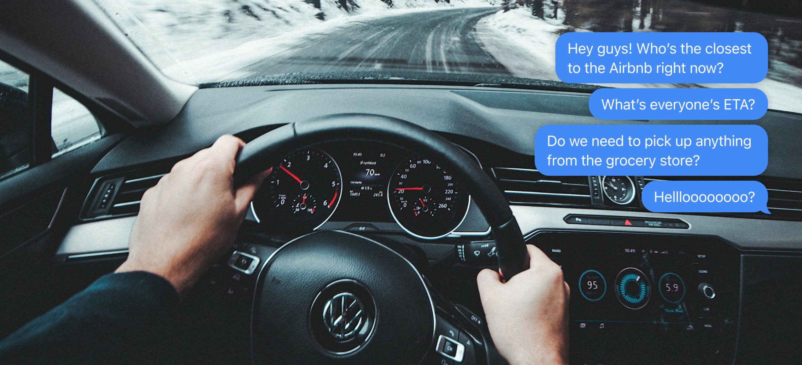
“Hey, where are you now?”
Taking a road trip with your friends in one car can be a fun, bonding activity but once you start traveling with more and more cars in a pack, it becomes easy to lose track of one another along the way. The group may start together but traffic jams, unplanned stops, and emergencies eventually split everyone up. This leads to difficulty planning, miscommunication, and a sense of disconnection. So how might we equip people who travel together on road trips (“road trippers”) with the right tools so that they can maintain real-time communication while also not distracting from the driving experience?
As the more social choice amongst GPS navigation applications, Waze is uniquely poised to tackle this problem.
guiding assumptions and decisions
The fine text at the beginning
Before I began the design process, I made a few upfront decisions to help guide my thinking:
- Minimize impact on the core product. As this is a feature addition into an existing product, it would likely be extremely difficult to make any wholesale changes. The success of this initial launch will depend on the feature’s ability to seamlessly integrate into the app as it is unless there is strong research to support further changes.
- Leverage prior interface decisions. I followed Waze’s decision to position its drive actions on the right side of the screen. Also, instead of designing new elements, I aimed to utilize as much of the existing design language as possible.
- Design for young adult drivers. The most active Wazers fall into the 25–34 year old age range. Also, given that Waze is a navigation app at its heart, I decided to keep the usability focus on drivers (as opposed to passengers).
understanding the issue
How do people who take road trips together communicate right now?
Conducting interviews and speaking with both drivers and passengers who have been a part of group road trips was helpful in learning current behaviors. Here are a few important learnings:
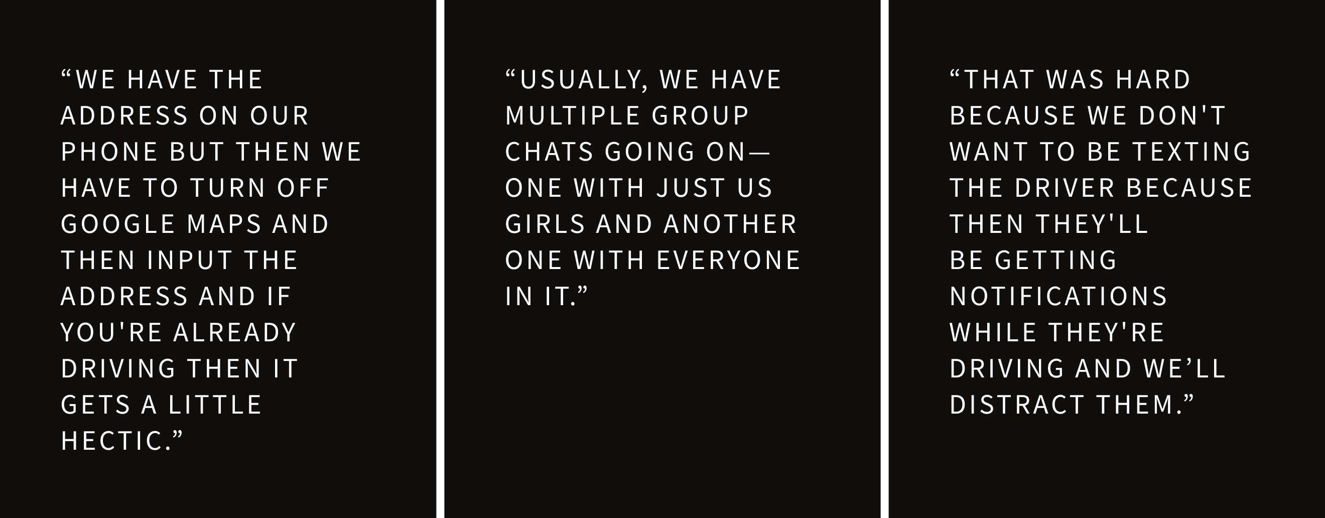
- Navigation and communication happen in two separate apps. Google Maps was the top choice for navigation and Apple iMessage was the top choice for messaging.
- Group dynamics are important. Because of the more intimate feeling of a text message, it is possible that not everyone on the road trip would be invited into the same group text thread.
- Drivers rarely act as the communicators. It is safer to have the primary passenger (who is usually sat next to the driver) act as the main communicator. This causes issues if a driver is the only person in their car.
- The most common type of information shared was regarding details needed once nearing the final destination. Some examples given were estimated arrival times, Airbnb codes, and grocery needs.
starting a road trip
A road trip’s existential crisis
To kick things off, I had to first think about what a road trip actually was. Where does the idea of starting a road trip actually begin in someone’s mind? Does it happen when you first open the app? Does it happen when you input a destination? Or does it happen after you select a route? Each option had its own merits. I mapped out each scenario to help me visualize a person’s journey.
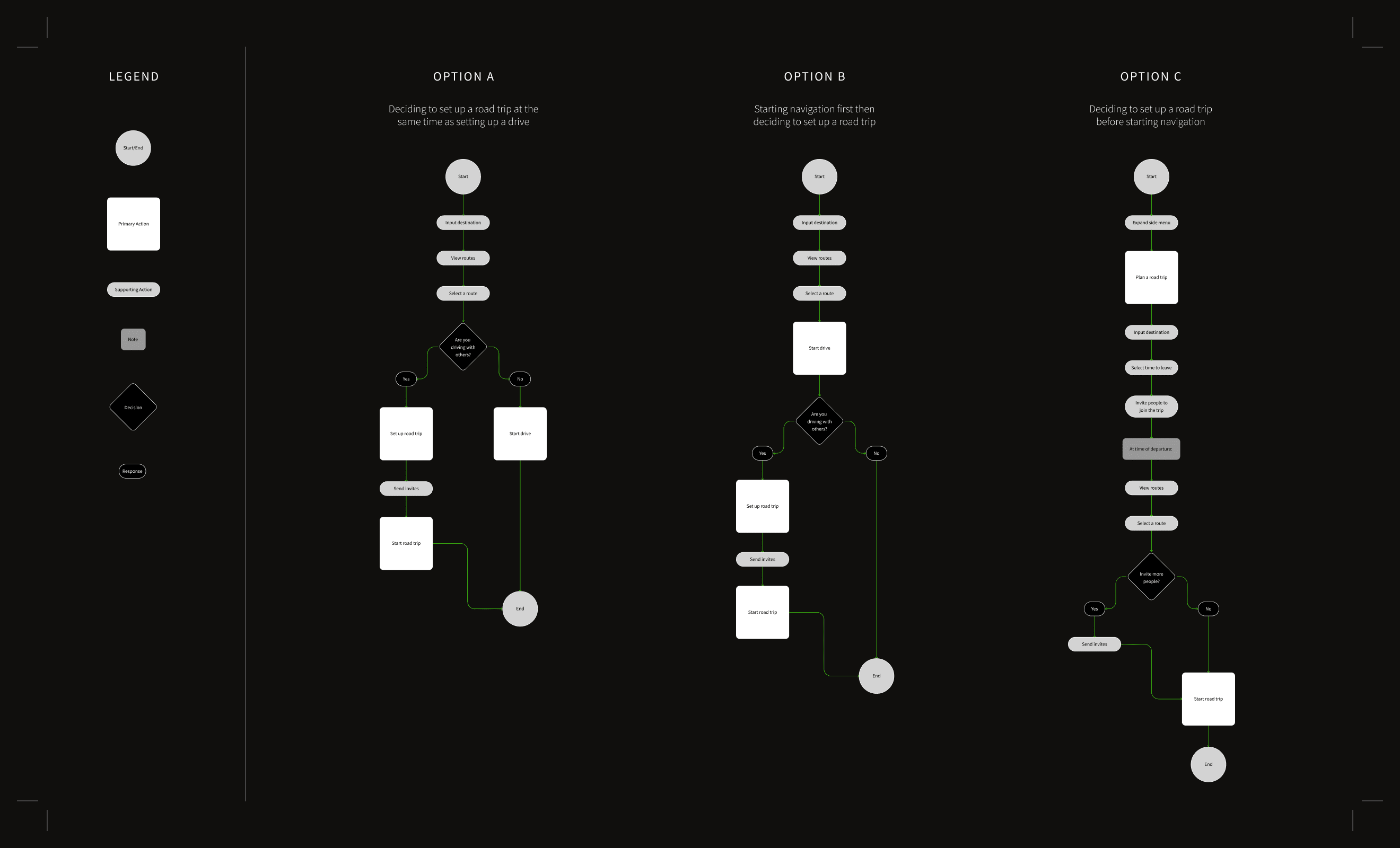
starting a road trip
Testing the initial options
After mapping out each task flow, Option C seemed to lend itself better towards a future-looking “Plan a road trip” feature as opposed to an in-the-moment “Start a road trip” feature. While valuable, it fell outside of the scope of this project and that flow was not pursued.
I then developed prototypes for Options A and B and went into user testing to see which one felt more natural for people.
roadblock
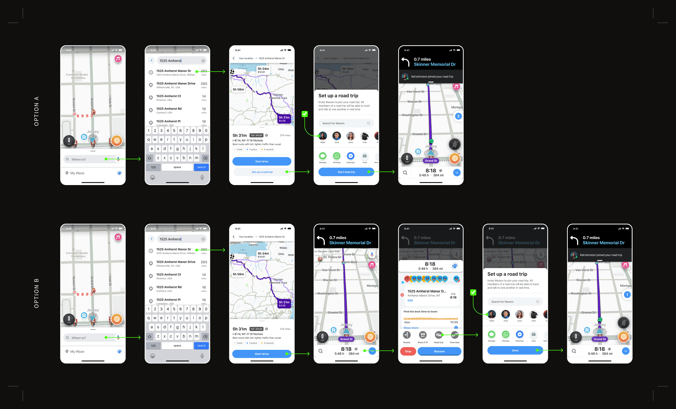
“Share drive” vs “Road trip”
Early on, I discovered a slight conflict. Waze already has a "Share drive" feature within the app that allows you to share your journey to a friend to follow along with for safety reasons. While it doesn’t allow someone to actually drive along with you or communicate in real-time, it is easy to see how this function and the new "Road trip" function could get confused—especially in the flow proposed in Option B. To help mitigate this, I updated the label and the icon to better identify the difference between the two.
starting a road trip
The results were neck and neck
I conducted usability tests with 7 people to see which path they preferred to take in order to set up a road trip. All participants were able to complete the task in both prototypes and when asked at the end on their preference:
- 3 participants stated Option A felt more natural
- 2 participants stated Option B felt more natural
- 2 participants stated both were about the same
It may seem that Option A has a slight edge, however, further testing would be required in a real-world setting in order to create a larger delta. It is also important to take into account the nature of the test—the task was to set up a road trip and having that feature presented front and center at the beginning may have caused some bias.
As the project timeline did not allow for further testing, I chose to take the route that aligned closest with Waze’s company direction. The core of their product is designed to get drivers from point A to point B in the most efficient way possible. Therefore, road trips is a supplemental feature to that purpose and should be placed in a location that supports that view. I chose to move forward with Option B.
real-time communication
Staying in touch throughout the trip
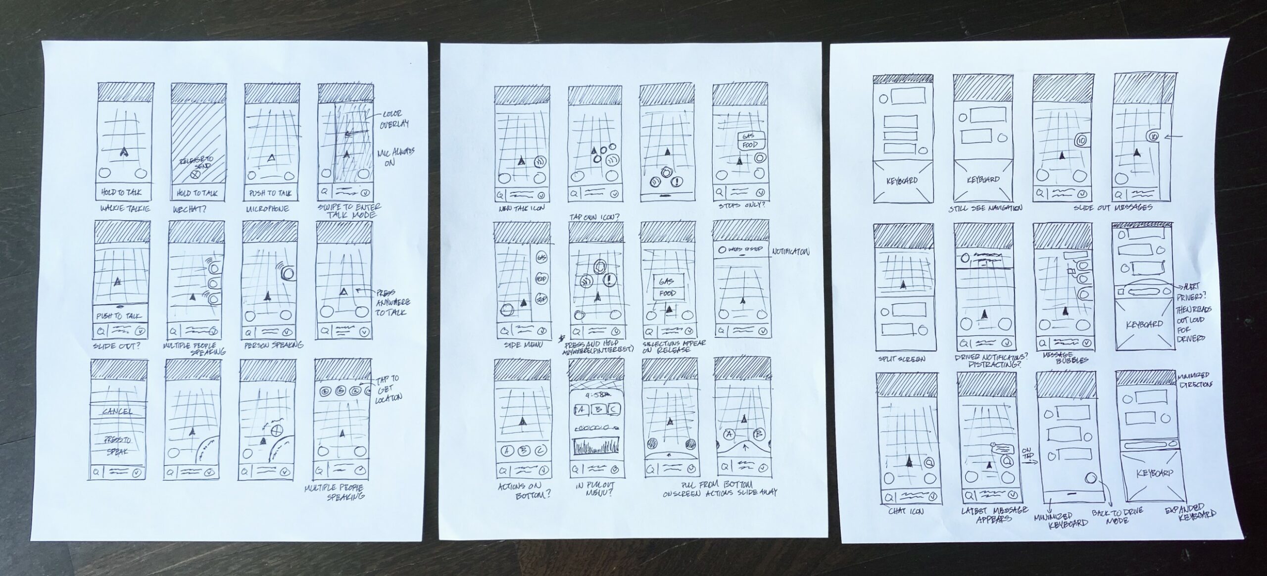
Now that the entry point for starting a road trip has been determined, what about the actual trip itself? How can we tackle the original problem statement and address the issue of real-time communication? I looked back over my notes from user research, brainstormed, and sketched out 3 possible solutions:
- Option 1: A Zoom-like feature that turns each road trip into a live phone call
- Option 2: Pre-loaded messages that road trippers can tap to send—such as “I need gas” or “I’m hungry”
- Option 3: A full-fledged messaging feature that will allow for text conversations
real-time communication
The live call rose to the top
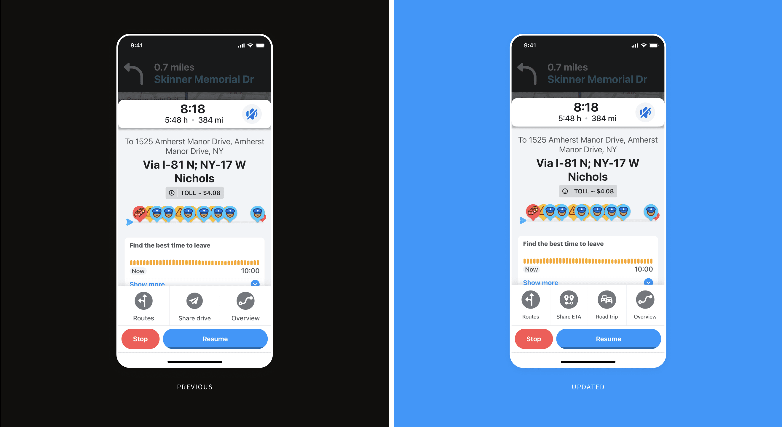
I listed advantages and disadvantages for each option and it was clear that the Zoom-like phone call was the winner. By speaking into the phone instead of using touch inputs, the driver is able to safely participate in conversations. This type of interaction also allows both drivers and non-drivers on the road trip to communicate through the same interface which decreases development time for this intial release. Talking live as if it was a phone call allows for a more complex level of communication versus pre-loaded messages but also does not require the distraction of actually reading a text message thread. Lastly, it was the option that has the least impact on the current interface as it only requires one button to function.
Wait, why a live call though? How about sending voice memos instead?
Sending voice memos is a good secondary option but can fall short for real-time information sharing. For example if one person asked, “Where do you all want to stop for food?”, there may be several different responses coming in at the same time. A user would then need to listen to each response in the order that they arrived.
highlights
Additional design solutions
Adding a feature to support group navigation opened up other interesting problems to solve such as invites and route updates. Below are a few highlighted examples of design solutions for those problems.
highlights
Accepting an invite
Waze was meant for solo navigation so we needed to design a way for multiple Wazers to join the same trip.
highlights
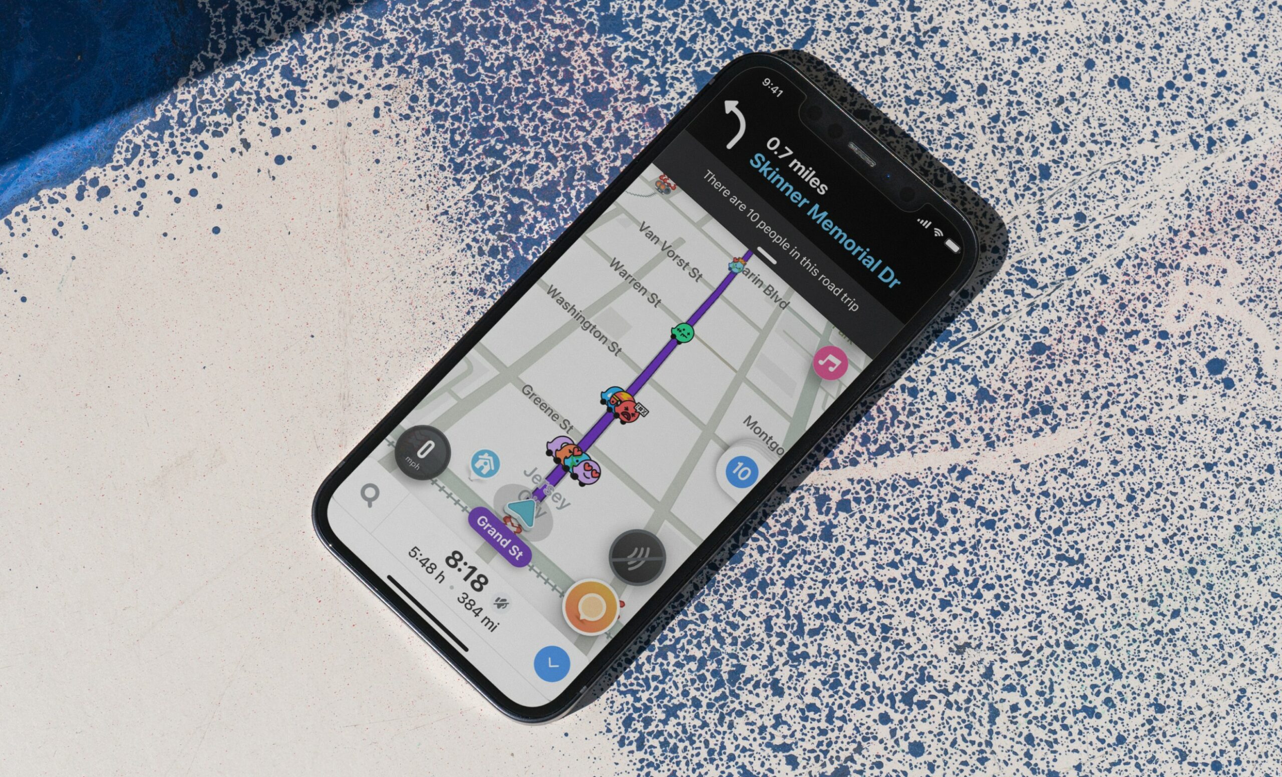
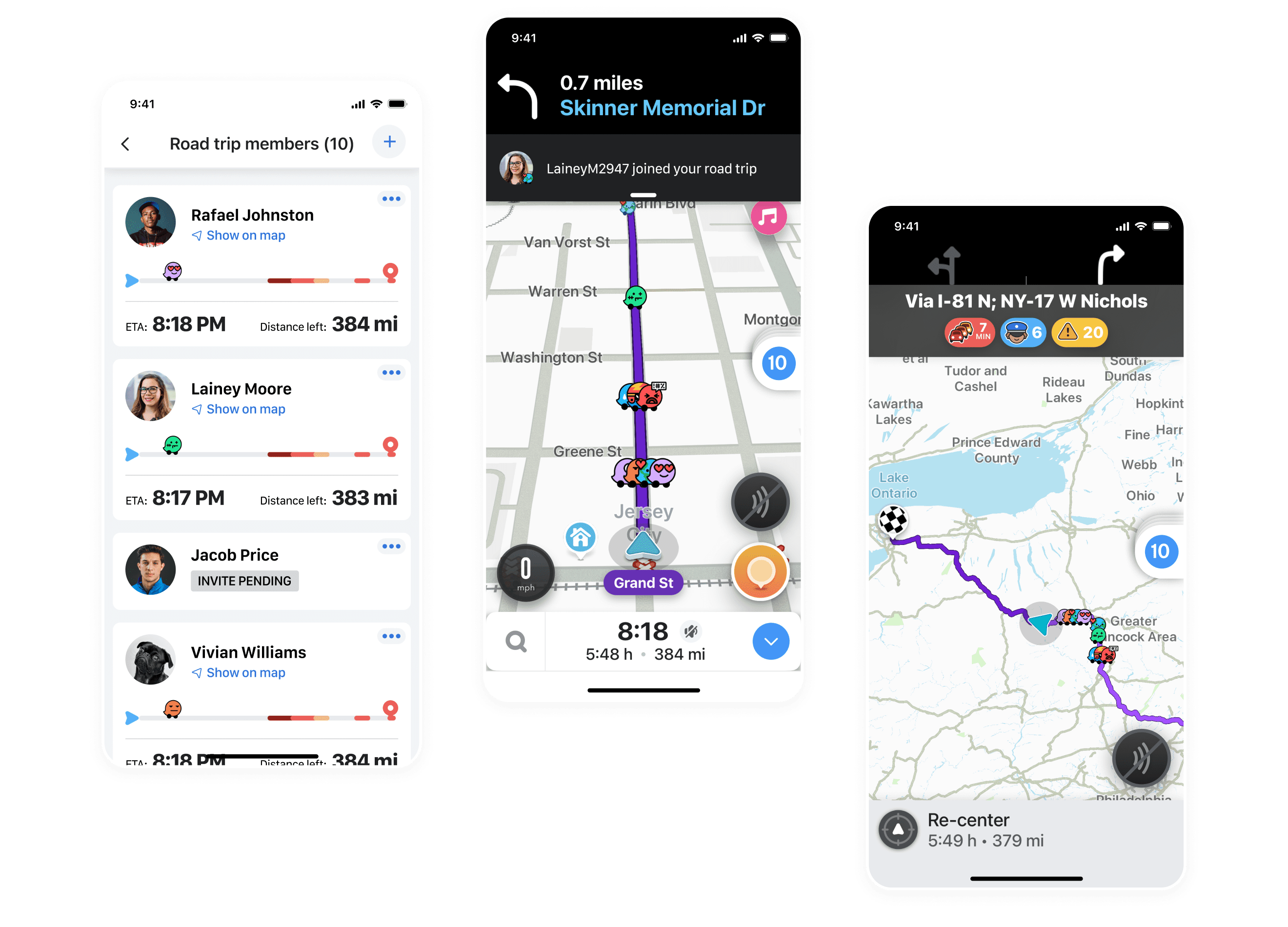
Tracking the other members of the road trip
This was the most requested aspect that came up during my initial research. Participants wanted a way to immediately see where other cars were along the route, know how far they were from the destination, and how long they had left to drive.
highlights
Editing members of the road trip
Once we had multiple Wazers on one trip, we needed to provide ways to edit those members as well. Users may need to add more members to a trip or remove a member.
highlights
Adding a stop along the route
Plans change and part of the benefit of this road trips feature is being able to update the route either just for yourself or for everyone on the trip.
highlights
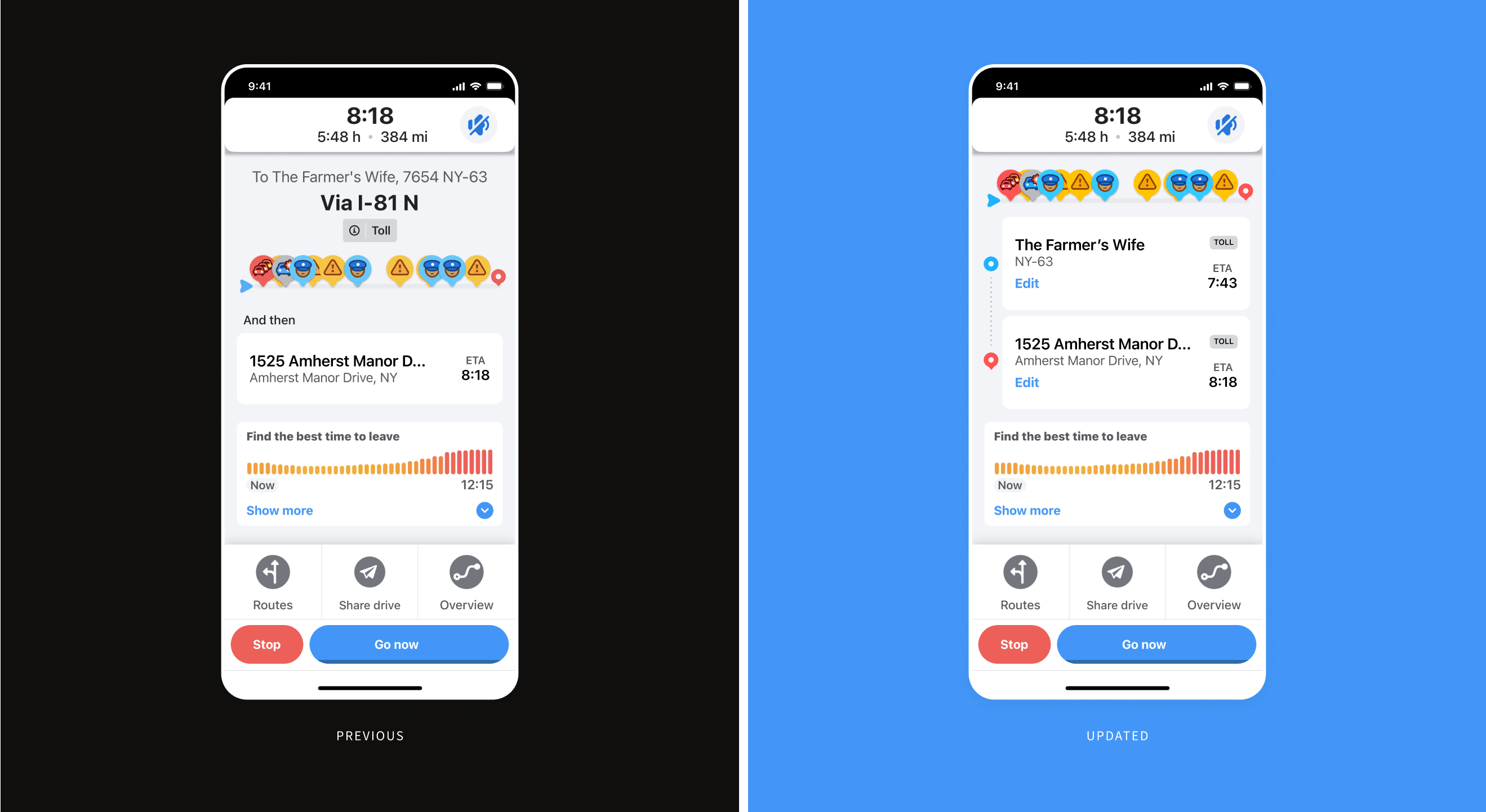
Editing your trip
The current Waze design doesn’t allow you to edit a destination on your trip which normally wouldn’t cause that much friction if you are driving solo—you can simply exit your current navigation and start a new one. However, that gets a little messy once you have multiple people on your road trip. You would have to cancel the current navigation, start a new one, and reinvite all members back. Therefore, I explored a different design that allows you to make edits without having to stop the current trip.
next steps
After the finish line
This new feature addition focused on improving the experience of a road trip functionally, however, there are further ideas to improve the experience socially as well:
- Group playlist: Allowing all members of a road trip to contribute to a synced playlist from Spotify or Apple Music
- Road trip games: Creating a voice-based trivia game that all cars could play together
prototype
this prototype starts with a road trip already in progress.